:format()//media/10-tips-to-reduce-UI-UX-friction-on-university-websites-sq.png)
Never place obstacles in prospective students' way.
For them, a college or university website is a doorway to their ideal future, so create the shortest distance from question to answer.
But, sadly, the reality is that the rush to showcase faculty achievement and student opportunity can often lead to a "digital obstacle course".
What does that look like? Too much information (or outdated information) on the screen; confusing menu terminology and navigation; failing to properly adapt your website experience on mobile devices.
All of these lead to cognitive load and can drive applicants away.
Reducing UI and UX friction is about more than aesthetics; what's needed is to ensure the path from curious "window shopper" to "enrolled student" is as intuitive and welcoming as the physical campus itself.
Here are 10 tips to reduce UI/UX friction and frustration in college and university websites:
1. Focus on intention with task-based navigation
Rather than a traditional org-chart-style website that mirrors a university's internal directory, move to a task- or intent-based model.
Task- and intent-based navigation mirrors how students naturally think, helping them find what they're looking for based on goals and tasks rather than the school's internal structure:
| Intent-Based (task-oriented) | Traditional (org-oriented) | How it reduces friction |
|---|---|---|
| Transcripts & records | Registrar's Office | Students might not know what a "registrar" is, but they'll definitely understand "transcript". |
| Pay tuition & fees | Bursar's Office | Removes "academese" (important if English isn't visitors' first language) and focuses on the action (paying) rather than the department. |
| Campus life & student support | Student Affairs | "Affairs" is vague and can represent many things. But "campus life" creates a mental image of students' actual experience at your school. |
| Apply now | Enrollment | "Enrollment" sounds like an internal metric for recruitment success. But the verb-based call-to-action "apply" is the first step in students' journey. |
| Cost & scholarships | Financial Aid Office | "Cost" helps answer the most important question right up front: Can I afford this? |
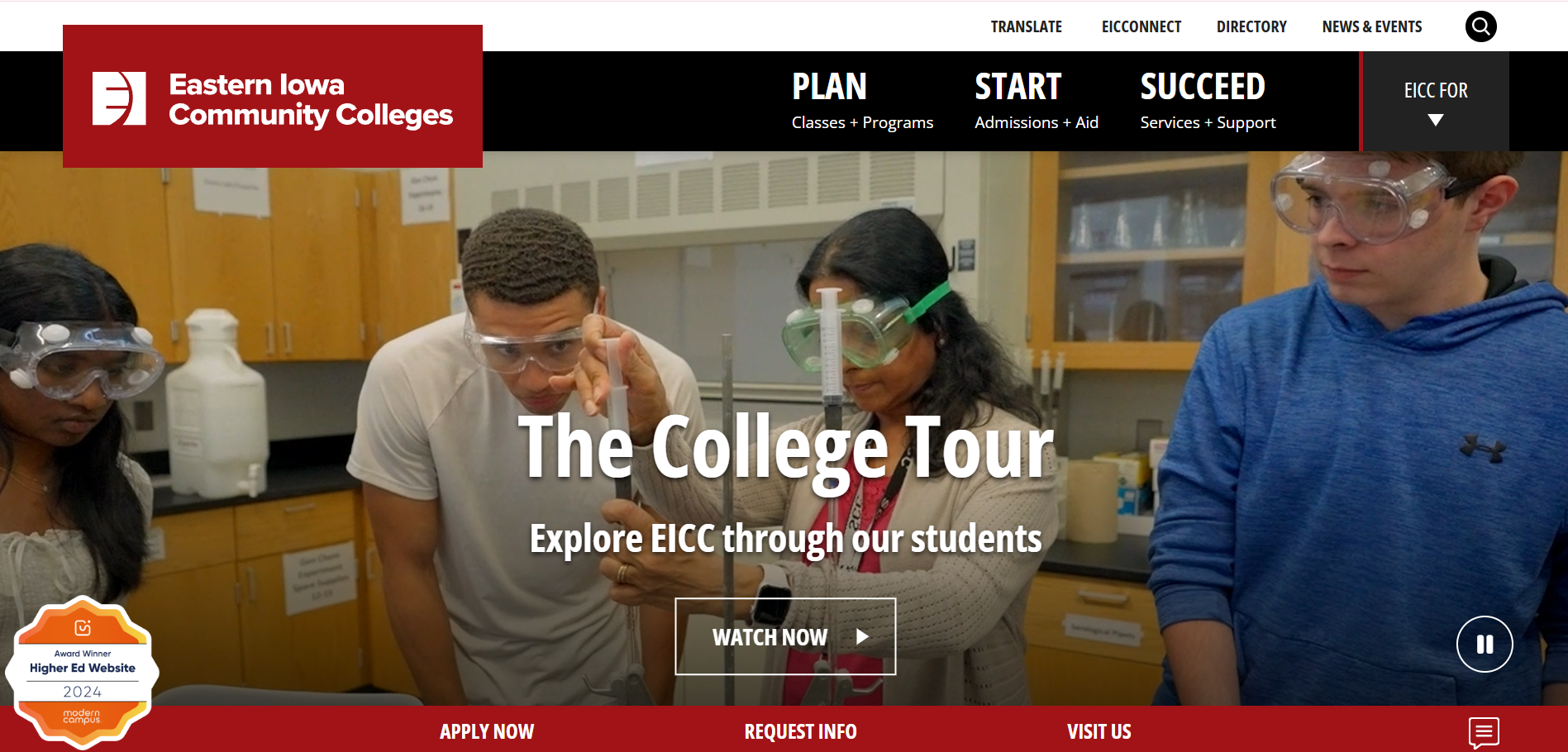
Eastern Iowa Community Colleges, a Best Higher Ed Website winner (2024), uses task-based top-level navigation that reflects students' journey—PLAN, START, SUCCEED—making it instantly relatable to applicants instead of traditional noun-based menus that represent faculties and departments.
2. Unify tools and implement Single Sign-On (SSO)
Fragmented digital tools, multiple logins for different systems, and disjointed brand design language increase user friction and reduce satisfaction.
According to a recent higher education marketing study conducted among over 1,000 higher ed students,
- 95% of students demand a single, cohesive platform
- 60% of students spend 5+ minutes searching for basic information
Two-thirds navigate multiple platforms to complete a single task
When you unify resources into one "digital campus" with a single set of credentials, you eliminate the "login fatigue" often associated with disjointed tools that forces students to keep track of various usernames and passwords.
3. Stay on track with breadcrumb navigation
College and university websites are notoriously deep.
Even meticulously organized sites can often reach beyond six levels of sub-pages.
In UI/UX design, breadcrumb navigation is like a "You Are Here" indicator on a map.
It helps visitors understand exactly where they are within a website's hierarchy and allows them to backtrack to any previous level, without having to press the "back" button repeatedly or, worse, getting lost.
This is especially useful if a prospective student enters deep inside a higher ed institution's website hierarchy from a search engine results page.
The breadcrumb navigation will tell them exactly where they are.
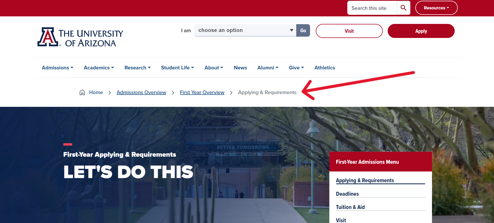
The University of Arizona's breadcrumb navigation lets prospective students know exactly where they are and allows them to jump back to parent pages without relying on the "back" button.
4. Use progress indicators to eliminate the unknown[a]
Have you ever tried filling out an online survey or creating an account for a service only to fall into a black hole?
Progress indicators provide you with a "psychological boost" by showing you how far you've come and how much is left.
Whichever indicator you choose, progress transparency sets expectations and reduces abandonment by providing a clear "finish line".
Three common progress indicators are:
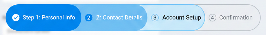
1. Step-by-step progress indicators
This classic "breadcrumb" style indicator shows the user's current progress and is best for forms with a fixed, logical sequence where the user needs to know exactly how many stages remain.
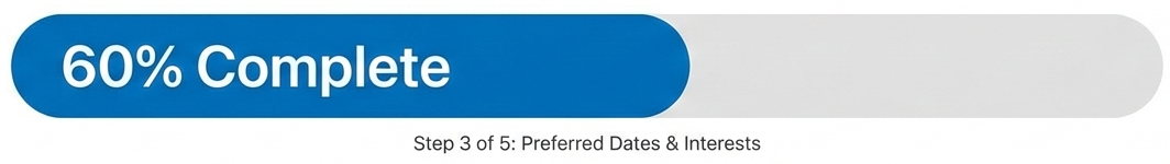
2. Percentage-based progress indicator
These indicators provide a quantitative look at how much of a process is completed and are best for very long forms (like surveys) where listing all the steps or pages might feel overwhelming.
3. Simple text-based progress indicator
This minimalist approach forgoes graphics with simple "Page X of Y" or "Question X of Y" statuses and are best for short (5 pages or less) forms where a graphical bar would be overkill.

5. Enable auto-save functionality and "not-saved" warnings
Imagine how frustrating it would be for a prospective student to spend over half an hour mulling over their answers for a scholarship application and then having all that work wiped out because of a session timeout or accidentally closing the browser tab.
Auto-save functionality and tab-/browser-closure warnings ensure that prospective students don't lose all the information they enter onto online forms.
These two simple usability features prevent a potential disaster and show that your school respects students' time and effort.
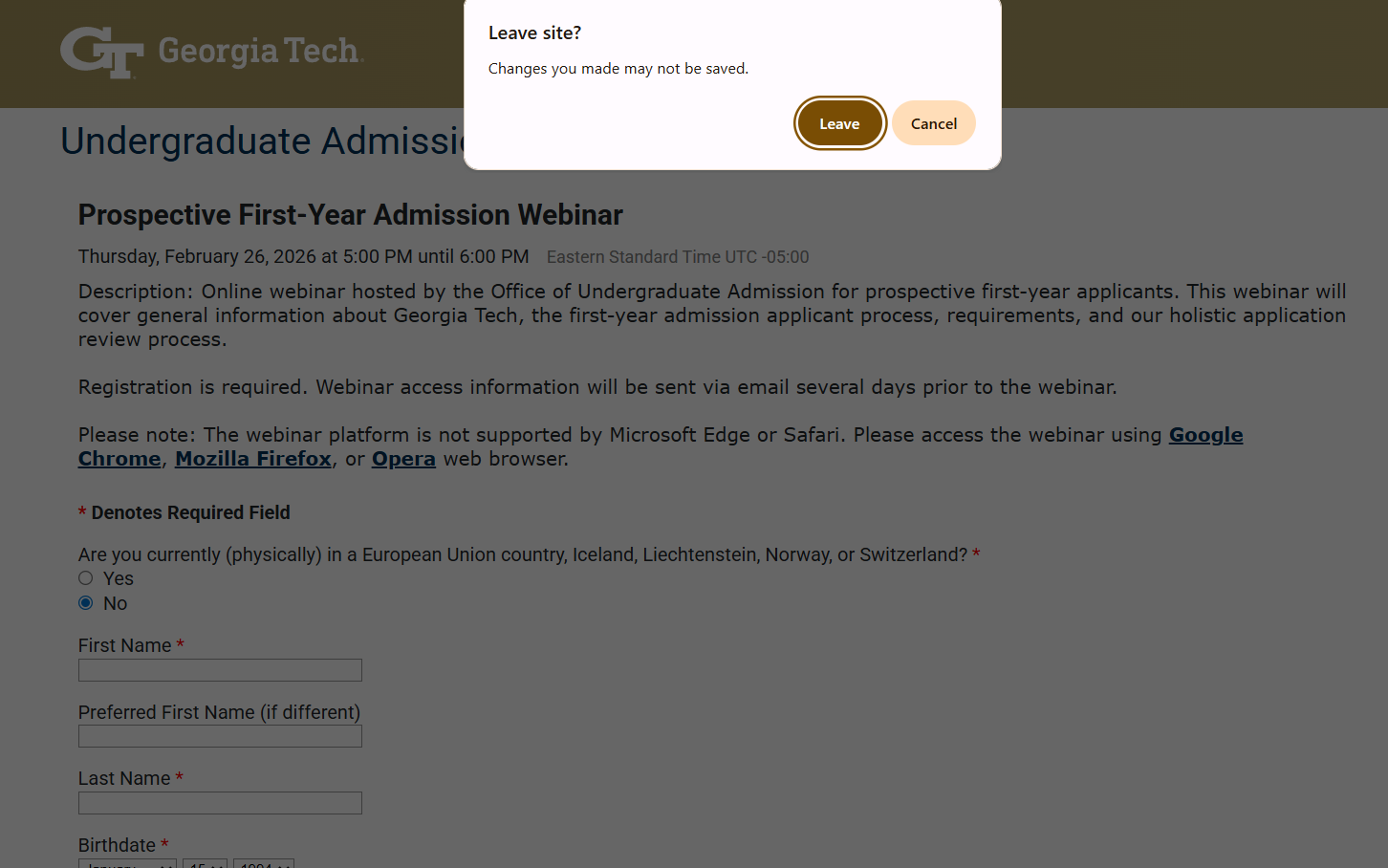
Trying to close Georgia Tech's partially completed Webinar registration form presents users with a warning that their entered information hasn't been saved and will be lost if they close the page.
6. Apply conditional logic in forms to target different students
Long, multi-page forms are one of the biggest sources of visitor friction in higher education websites—especially if a majority of the questions aren't applicable to the prospective student or their situation..
Imagine a student wading through a list of financial aid questions when they've already indicated they're fully funded by their employer.
Conditional logic, based on several initial questions, allows you to build shorter "on-the-fly" forms so students only see relevant questions. This will increase completion rates and reduce student frustration.
7. Adopt plain language standards
Nothing creates distance between the message and reader more than jargon-heavy text.
Like the corporate world, higher education websites can fall prey to language that may be common among industry professionals but is alienating to most prospective students.
Academese—"pedagogy", "matriculation", "practicum"—should be avoided in favor of natural and conversational language. But, if a technical term can't be avoided, add a hover-over definition (known as a "tooltip"). This ensures students aren't forced to use a dictionary when applying for admission.
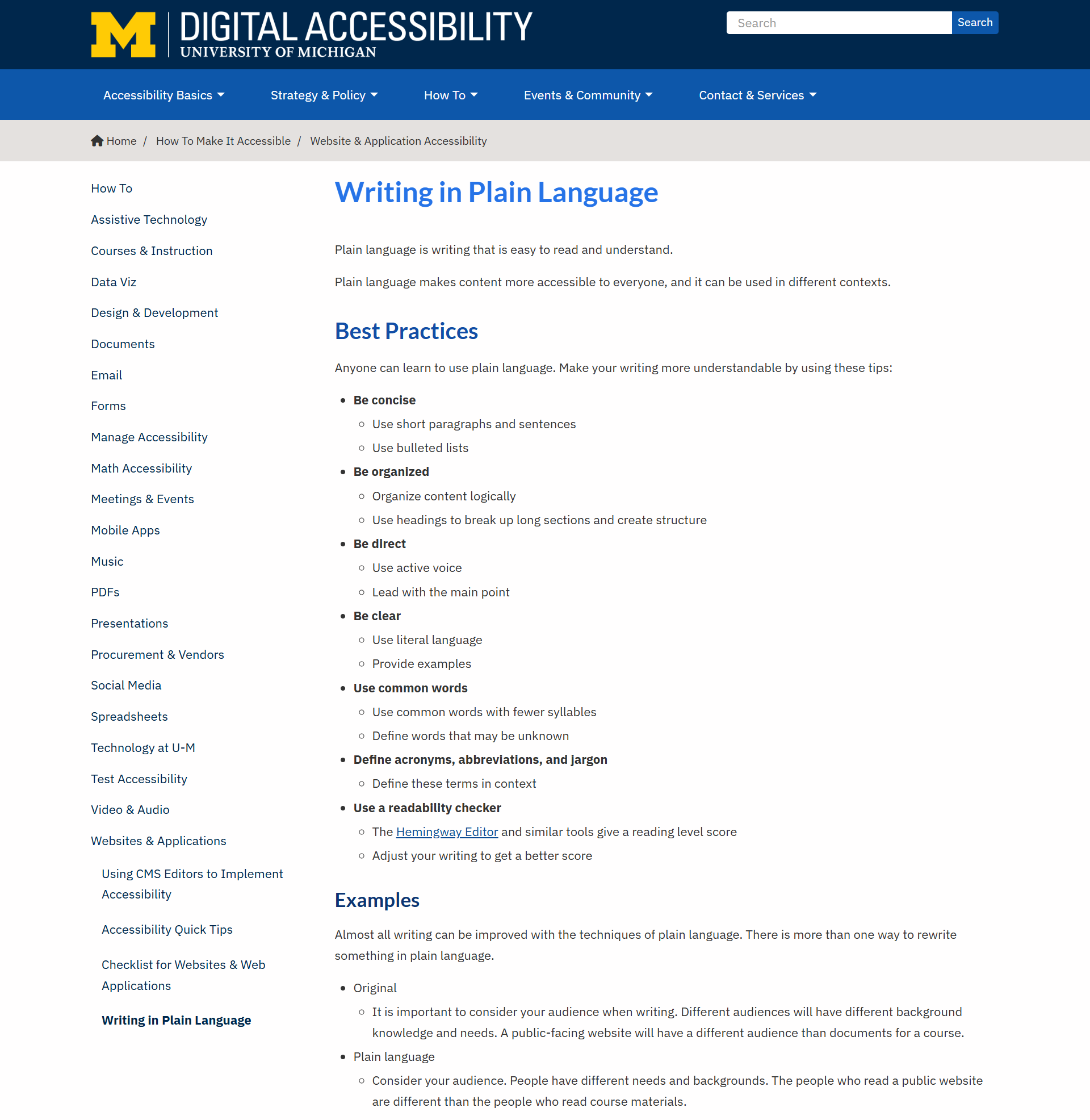
University of Michigan's accessibility team provides a concise "Plain Language" guide with before-and-after copy examples on how to avoid distance-creating academese.
8. Save time with real-time data validation
It's a UX failure to make website visitors wait until they try submitting an online form to discover there are mistakes in one or several fields.
Real-time validation provides immediate feedback on content entry errors, such as incorrectly formatted zip codes or email addresses.
This small UX feature plays a big part in helping online forms feel more like a conversation rather than a test.
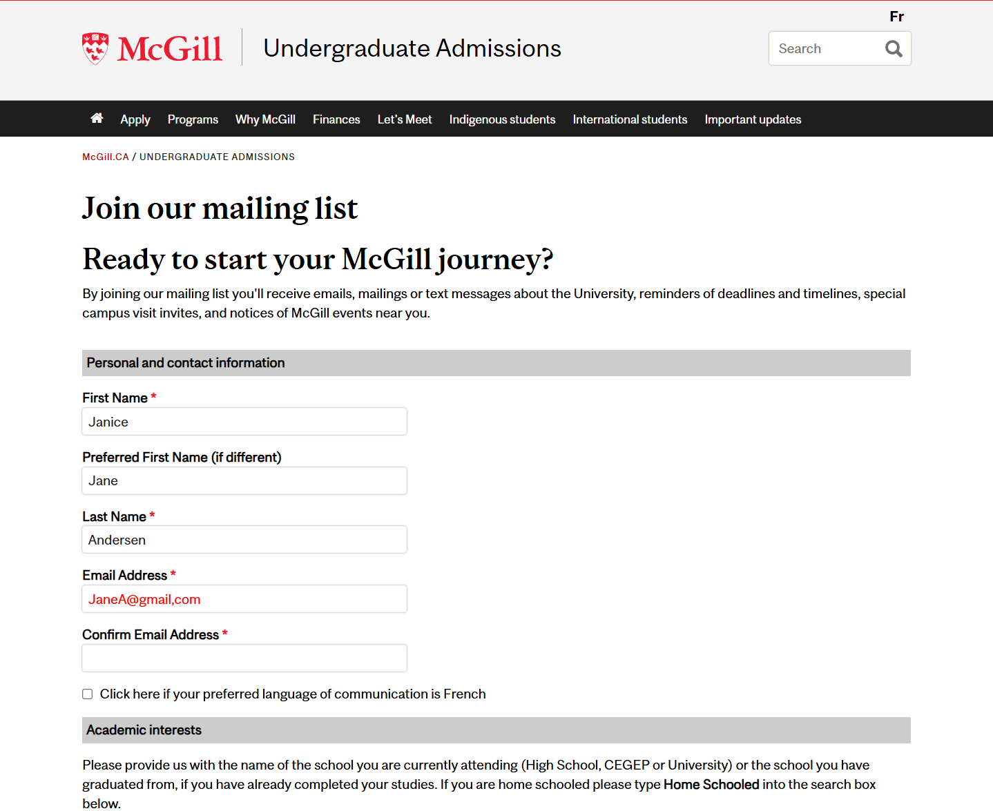
McGill University's mailing list subscription form lets visitors know immediately that they make a mistake, such as entering ",com [comma]" instead of ".com [dot]" in an email address, using a highly visible red font once they move their cursor out of the field, not when submitting the form.
9. Implement smart chatbots
Sometimes prospective students visit your website not to browse a mountain of information, but to find the answer to a single question.
Rather than forcing them to navigate through multiple menus or a long list of FAQs, offer a chatbot that can serve as frontline support for direct questions.
Smart chatbots can handle the majority of routine questions about application deadlines, office hours,and locations, financial aid information, campus life, and student support services.
Instant answers, especially during off hours, reduce the friction of manual navigation or waiting several days for an email response from a university staff member.
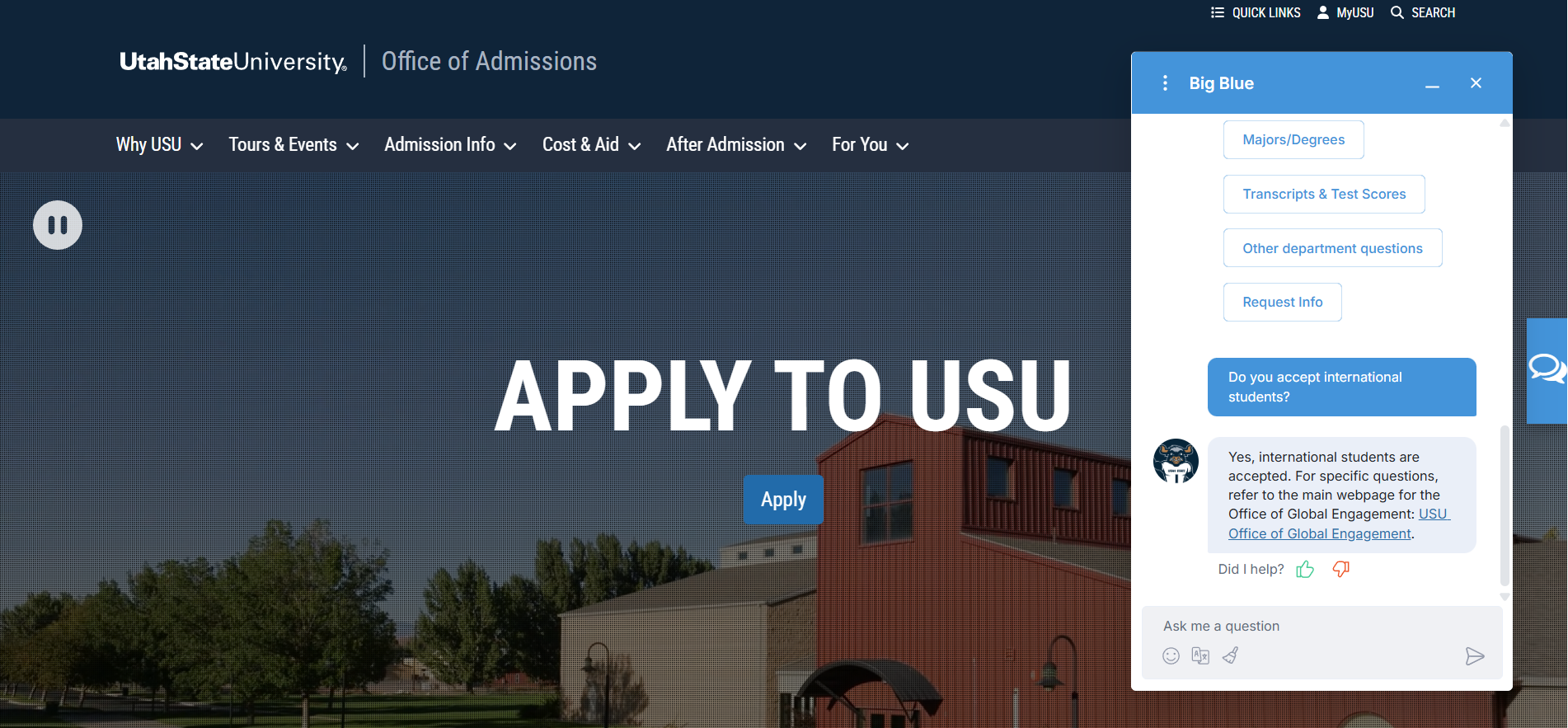
Utah State University provides prospective students with a smart chatbot to answer routine questions or redirect visitors to a page where they can find additional information.
10. Provide an easy path to human help
AI Chatbots are great. Superbly written FAQs are wonderful. But sometimes students simply need help from a human being. This non-negotiable UX option must be front-and-center to prevent visitors from giving up.
At its most basic, you can simply provide an "exit ramp" to human support wherever you offer virtual support.
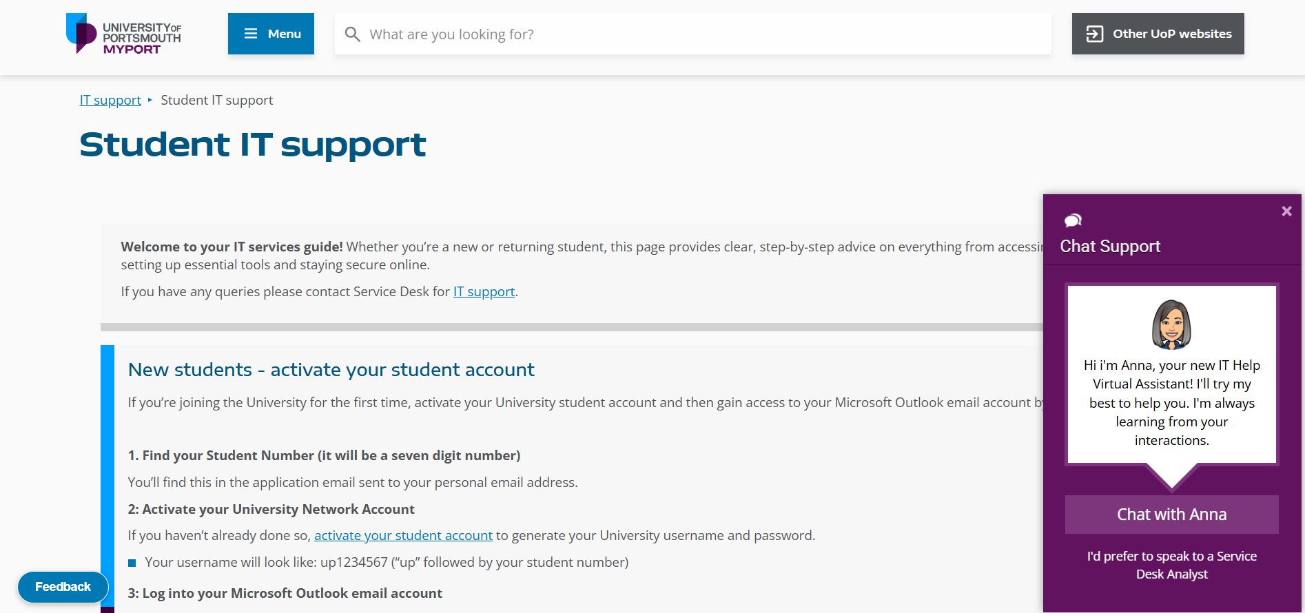
University of Portsmouth's student IT support page provides a virtual assistant for basic problems, but there's an easily accessible "exit ramp" to reach a human Service Desk Analyst.
Or, if you want to control the traffic to human support staff, you can encourage virtual help first and implement a "behavioral trigger". For example, if a website visitor spends more than five minutes trying to find an answer on a chatbot, they will then be presented with the "exit ramp" to human support.
User experience is a recruitment tool
For prospective students, your website is often their first real experience of your institution.
If finding information feels harder than finding a lecture hall during Freshers' Week, something has gone wrong.
The same care you put into SEO, content strategy, and recruitment campaigns should extend to the user experience. Make sure your website works as well on a phone as it does on a desktop. Keep forms simple. Help students find answers quickly without making them jump through hoops.
Every piece of friction you remove makes it easier for someone to take the next step, whether that's exploring