:format()//media/Audience-specific-landing-pages-for-higher-education-RQ.png)
A landing page needs to not only reflect the DNA of the school, but it must also speak directly to those it's trying to reach and connect with.
University and college landing pages have several minutes, maybe even several seconds, to create an impression.
Depending on that impression, they will either stay on the site or leave.
Are your landing pages doing enough to keep prospective students interested?
Micro-goals for landing pages
When designing landing pages for your school's website, enrollment might be your ultimate goal, but it shouldn't be your only one—especially as a landing page is only a single page.
Instead, think in terms of micro-goals.
Your landing page call-to-action (CTA) goal might not be to click an enroll button; instead, it could be to continue on to another part of your site.
Your micro-goal could be to keep prospective students on your website long enough to look up enrollment and degree information, schedule a visit, or donate to the school.
General landing pages can be effective if they're done properly and linked to your campaigns.
But you'll stand a better chance of maximizing conversion rates or having them carry out certain actions by using imagery and copy that connects directly with them.
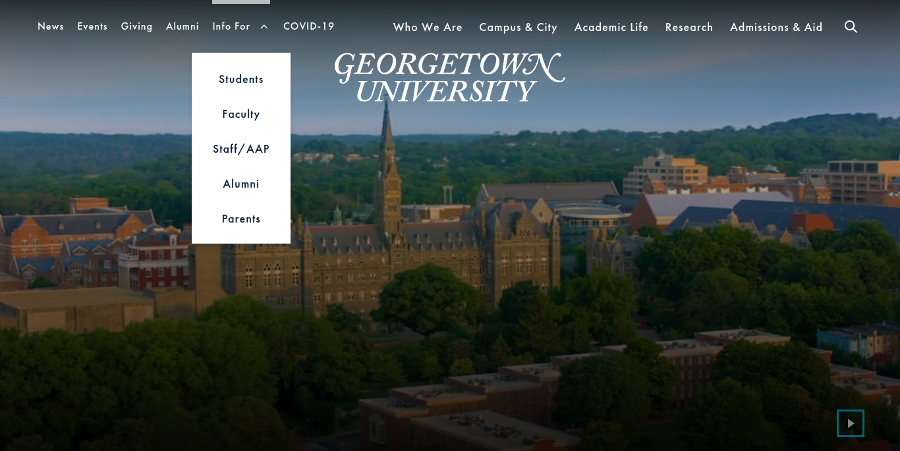
The main landing page for Georgetown University smartly organizes pages for different users in its top navigation menu, providing easy access to information specific to students, faculty, staff, alumni, and parents.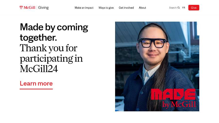
McGill University's “Giving” donors landing page has clear CTAs and rewarding cause-and-effect messaging, highlighting how donations have contributed to the school's various philanthropic initiatives. Farther down the page are inspiring stories about giving, campaign progress tracking, and a quick donation feature.
Standard content for all visitors
Visitors to college and university websites will look for different things, with their own sets of priorities.
But there are certain elements common to all, so this information needs to be easy to access and given prominence on your landing pages, regardless of the audience.
According to 2020 results from Statista, visitors to US college and university websites looked for common content:
- 95% of visitors looked for information about majors and academic programs.
- 93% of visitors looked for information on the cost of attendance.
- 78% of visitors looked for information on how to visit the school in person.
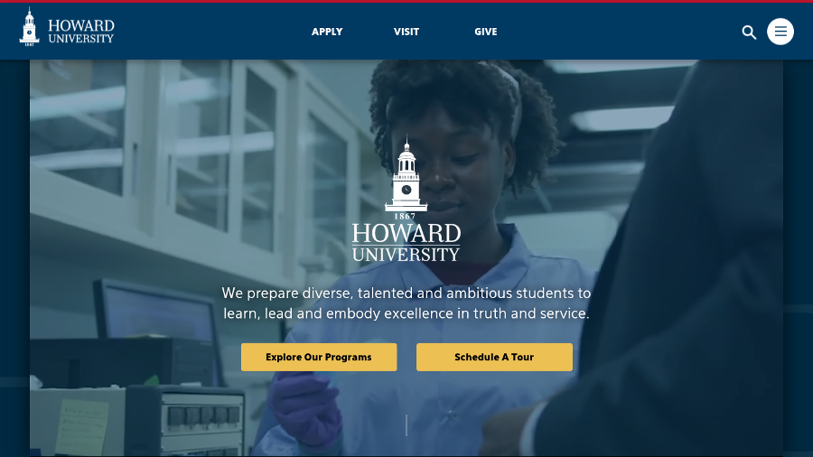
Howard University, renowned for its STEM programs, uses a clean and minimalistic landing page, featuring video of students working in a lab, faculty and alumni speaking at events, and aerial views of its campus. Suitable for any visitor demographic, the landing page has three very clear CTAs: APPLY, VISIT, and GIVE.
Traditional students
It's not uncommon to see graduates still donning their school's emblem or cheering for their alma mater's varsity teams long after they graduate. Why?
It's because for traditional students, those that fall into the 18- to 25-year-old demographic, college or university is their “first” for many things.
This is especially true for those who will be living on campus or moving to another city.
It's their first time away from home, their first true taste of independence and responsibility, their first time being part of a group or community.
As such, campus life and access to amenities can be a differentiator in their decision-making.
Landing pages catering to traditional students should give them not only degree and enrollment information but also a slice of life at your school.
For example, campus amenities, extracurricular activities, and student-led affinity groups can separate your school from others.
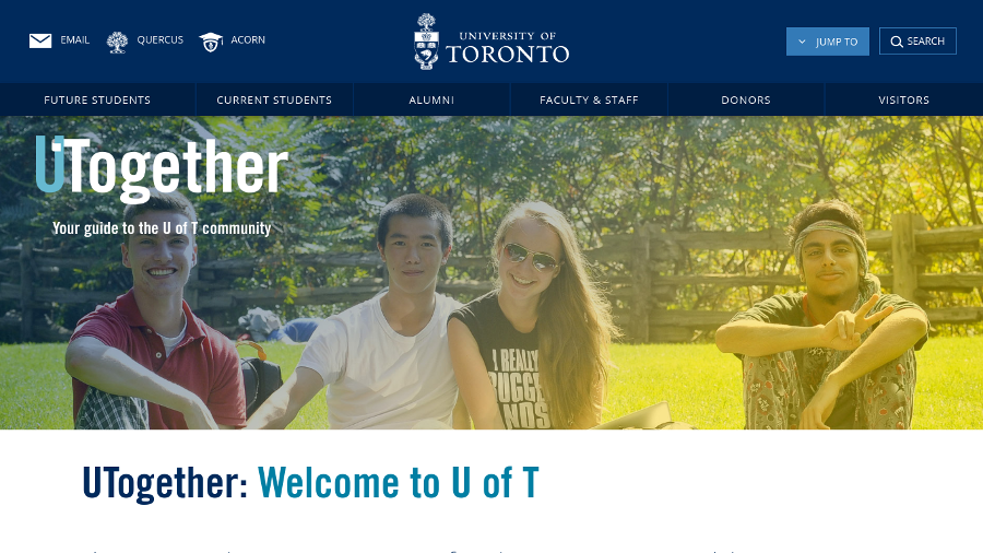
The University of Toronto's UTogether community landing page features an image carousel that gives visitors a view of students at work, rest, and play. The top navigation bar is perfectly categorized for future students, current students, alumni, faculty and staff, donors, and visitors.
Scrolling down provides information on where to eat, study, and gather at the school; finding clubs of interest; and information on student mental health and how the school is promoting a safe environment.
Adult learners
Most adult learners, those 26 years and older returning to school for various reasons, are well into their career—with a full-time job, children of their own, time commitments, and financial responsibilities that extend beyond school fees.
They have numerous outside obligations and, unlike traditional students, care less about campus life and extracurricular activities.
Instead, they're more focused on how a particular program or degree can contribute to their current career path.
Landing pages catering to adult learners should give them quick and easy access to information related to their program/degree of interest, flexible delivery methods (on-campus, online, and hybrid classes) and class schedules, time-to-completion for their program or degree, and support services that cater to the particular needs and concerns of adult learners.
(To find out more about marketing your university to adult learners, have a look at our previous blog post about this topic.)
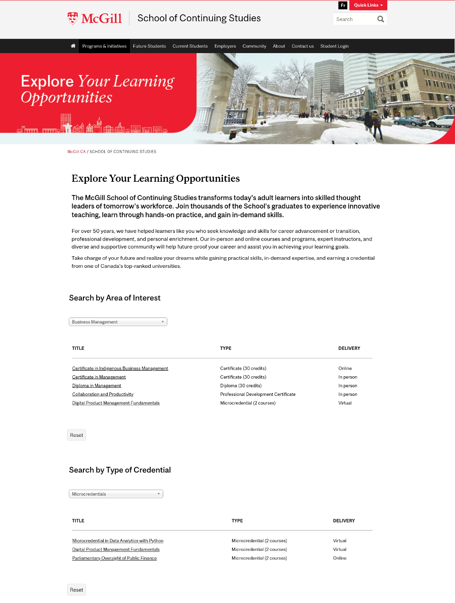
McGill University's School of Continuing Education landing page gives adult learners the ability to narrow their options by areas of interest (such as Artificial Intelligence, Information Technology, and Marketing) and type of credential (such as graduate certificates and diplomas, professional development certificates, and microcredentials). Each option also shows a delivery method (in-person, online, or hybrid) to help adult learners manage their time.
International students
International students face innumerable challenges when deciding to move to another country to begin or continue their post-secondary education.
They need to meet not only academic requirements, but must also tackle language barriers, admission prerequisites (not all credits obtained in their home country may be recognized), social and cultural differences, discrimination, and financial concerns.
Landing pages catering to international students should be reassuring and welcoming, providing information not only about enrolling in the school, but also about moving to and living in a new country—preferably in their native language.
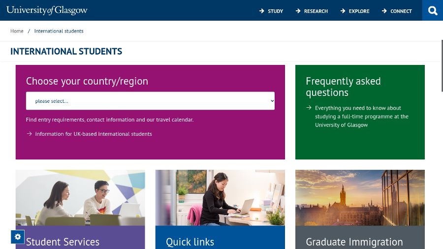
The University of Glasgow's International Students landing page presents relevant information to visitors based on their selection on a “Choose your country/region” dropdown box. In addition to content related to the visitor's country of origin, the page also contains general information for international students, such as visas and immigration, international students support services, Study Abroad and exchange programs, and English language requirements and courses.
Parents of prospective students
Parents are obviously not prospective students, but they may hold sway over their kids' decision to apply to a particular school.
So when designing landing pages, don't neglect parents—many of whom will be financing their child's education and have concerns over their kids welfare and safety.
Landing pages catering to students' parents should provide information not only on costs and tuition, but also on student safety (especially if they're going to be living on campus) and how they can get involved in various school initiatives.
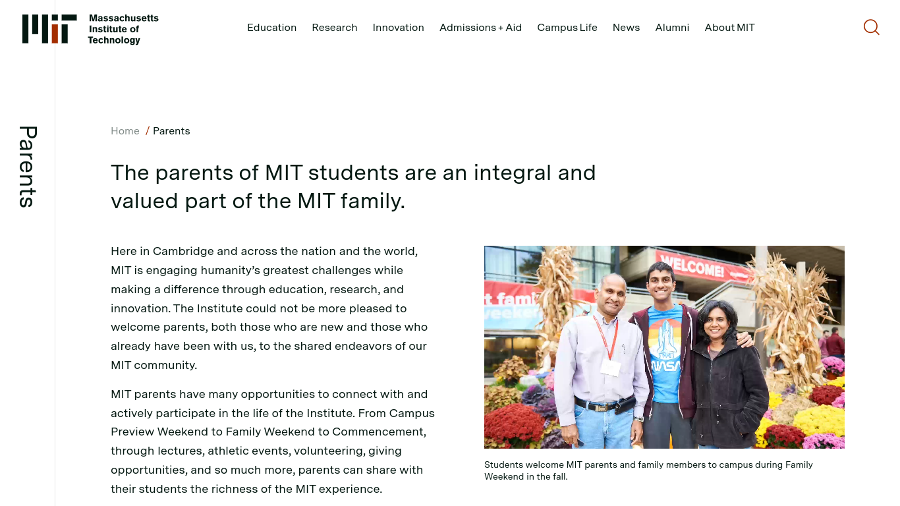
The Massachusetts Institute of Technology's (MIT) parents landing page contains pictures of students and their parents along with information about on-campus family events, housing and dining options, student health and safety services, MIT Parent Resources, and even a dedicated and easy-to-remember email address: mykidis@mit.edu.
Landing page tips
Keep your copy short and actionable. Whether your landing page is permanent or for a time-limited marketing campaign, think of easily actionable micro-goals that you want visitors to fulfill.
- List the benefits, short- and long-term, of attending your school.
- Use high-quality, original photos and videos—preferably professionally commissioned, if possible. Stock images and photos are great if you just need something simple for a specific marketing campaign, but a landing page that relies entirely or too heavily on stock elements will lack the “wow factor” to truly capture your visitors' attention.
- Don't try being everything to everyone on the same landing page. For example, if targeting STEM students, use imagery that conveys innovation. If targeting artists and designers, show real portfolios of students work in exhibitions.
- Standard content should always be accessible (such as information on degrees and programs, costs, campus tours) in “collapsed” mode and should never crowd landing pages.
For more ideas of how to use landing pages to generate leads, check out these two other blog articles on our site:
- Part 1: How to hook more leads with your landing page
- Part 2: How to hook more leads with your landing page
Do you have any favorite techniques to target specific landing page visitors?
We'd love to hear about it in the comments below or on our social media channels.
 |
 |
 |
|---|