:format()//media/The-best-ways-to-hook-more-leads-with-your-landing-page_RQ.png)
Creating a marketing campaign doesn’t mean reinventing the wheel every time. Campaigns tend to be made up of a few elements that can be modified and re-used each time there’s a new one. For example when we host a webinar there tends to be at least a couple of elements that need to be created:
- Landing Page
- Marketing automation programme
Both of these are based on reusable templates so most of the effort tends to be focussed on set up but for each subsequent roll out the marketing team, no matter how technical or otherwise, have control over altering content and even layout.
What’s a Landing Page anyway?
A landing page is the destination we send visitors to when they click on an ad or another link with a specific outcome, like signing up to a newsletter or webinar. Typically, an inside page of our website but by and large the most successful ones are stand alone without navigation links to other pages on our main site. The reason? Focus.
Landing pages should be clear in intent so anything that detracts from our goal should go. It comes down to Hick’s Law – namely that the time it takes to reach a decision increases as the number of alternatives increases.
Since landing pages are focussed on a single outcome every part of their design and content should be created with that goal in mind. If something isn't contributing to that then consider changing or letting it go.
Landing Pages fall into two categories:
Click through
We can think of this like a “warming stage” in the sales process so if we want someone to “Like” us on Facebook or download our App we can use this type of landing page which lets the visitor know who we are as well as the benefits of getting to know us better
Lead generation
This is very much an inbound marketing strategy and is based around a simple transaction – we offer a visitor a proposition (useful webinar or whitepaper, free trial etc. ) and in return they give us their details. A prospective customer’s details are valuable so don’t squander the opportunity you have for short-term gain i.e. don’t be annoying.
Call to Action
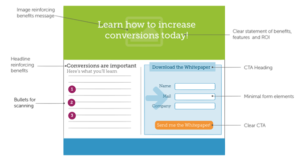
Our Call to Action (CTA) provides clear instruction for the visitor. It’s important that this is clear – we don’t want our visitor to be asking themselves what they came here for or even feel as though they are getting the hard sell.
To minimise confusion the headline should echo the messaging of the originating link or display ad. That said, it’s also important to ensure that the headline makes sense on its own since visitors can arrive from other sources like referrals or organically. All imagery or copy on the page should be aligned to provoke the CTA’s response.
Abandonment Issues
Page abandonment often comes down to a ‘perceived friction’ causing an initial interest to wane – slow page load time (because of large images) and relentlessly long forms with ambiguous labels and annoying, unnecessary reCaptcha boxes are the two main culprits here. Remember there’s a proposition on offer for your visitor so making them jump through hoops will just result in them leaving for a less needy, younger and probably better looking prospect.
There's a lot of talk of the best colour to use (orange apparently though probably not on an orange background) but regardless of the one you choose ensure that it stands out enough to prompt or entice your site’s visitor to click on it. Again any confusion over buttons not necessarily looking like buttons or blending too much into the background will be detrimental to your conversion. Wording comes into play here too. ‘Submit’ or ‘Commit details’ on the button sounds like I’m talking to a machine rather than a human being so try a button label that at least makes your visitor excited about the proposition they’re embarking on with you. It’s going to be a blast!
Testing, testing…
The work isn’t finished when we launch a page (is a web project ever finished?). It’s here that we start A/B Testing to see what is working and, of course, what’s not. Remember every element of the page should contribute to the overall performance of that Call to Action so testing with tools like Google Tag Manager or VWO let us change parts of the page and run concurrent tests to see how performance is impacted by those changes.
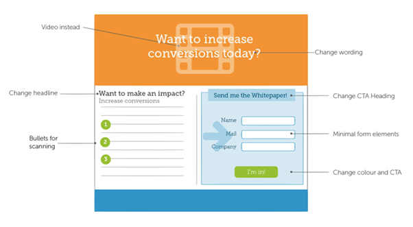
For example here we’ve swapped out a video in the header and tried different colour and copy variations.
The Landing Page templates we create in TERMINALFOUR give the marketing team full control to swap out imagery text and even change layout. Most of the effort is concentrated in the initial template set up but once that’s done we can reuse them over and over again for every campaign roll out.
Once a visitor signs up to a webinar it’s then the that the magic of marketing automation kicks in which we’ll look at in part 2….
In the meantime, don't forget to check out our brand new resources section full of free downloadable goodies!