:format()//media/optimizing-your-online-forms-RQ.png)
There are countless stories of the impact that forms have on conversion rates, like how Expedia made an extra $1m per year by removing one field, or how Marketo received 34% more leads by experimenting with their form length.
But despite the widely publicized benefits of form optimization, too often we still see institutions using ‘paper forms on the web’, that is, web forms that look like forms you’d fill out in print.
Sometimes this is because the institution’s CRM form builder dictates the form design (not ideal). Othertimes, form design simply falls off the list of priorities until the next major redesign opportunity for the website comes around.
But you don’t need oodles of time or specific technical skills to revamp your forms. Form design is something your digital team can review and optimize relatively quickly with high-impact results.
So, this week we’re sharing five best practices in form design to make your conversion points effective and easy to complete.
Let’s go!
1. Multi-step forms outperform single step ones
Splitting your forms into a few steps typically makes it easier for users to complete them.
There are a few ways this works.
First, short forms are less intimidating than long ones which present an overwhelming number of questions in one go.
Second, it allows you to ‘chunk’ information into relevant sections, much as you would for content. This means grouping questions about the prospective student’s interests, for example, before asking for their email or contact details in a separate section.
And third, you can indicate progress to encourage movement through the steps of the form. This sets expectations about how long it’ll take to complete the form, minimising drop-offs.
By setting expectations as to how long the form is and the typical time it will take to complete it can really help to minimise form drop offs and therefore increase form completions.
2. Use conditional logic to shorten your forms
You can use conditional logic to display questions based on how a previous question was answered.
Conversational format forms and chatbot technology use this technique very effectively, and it can also be applied to standard forms.
This approach can be highly effective and allows you to target the interests of a site visitor, like a prospective student, without overwhelming them with everything but the kitchen sink.

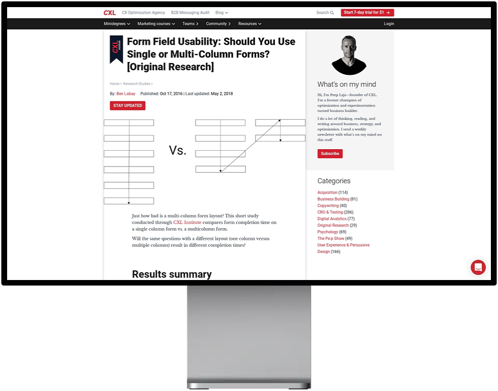
3. Use a single column layout on all devices
Eye-tracking studies have shown that simple one-column layouts are better than a multicolumn approach, except when you’re asking site visitors to fill in date details or where information is linked.
A study by CXL Institute also found participants were able to complete a single-column form an average of over 15 seconds faster than a multi-column form.
4. Clearly explain why you’re asking for sensitive information
Students are willing to share their information, but they expect it to be used to better serve them.
In your form introduction, explain what data you need and why to their trust.
A prospective student will be more likely to share their personal details if they know that they will be used to share course preferences and connect them with relevant academics in those departments, for example.
Your site visitors will increasingly be concerned about privacy and information security. If you need any personal or sensitive information, you should explain why it’s needed, how it will benefit them and how it’s used and stored.
5. Avoid using Captchas
Captchas force the issue of spam management onto your users, causing friction and deterring leads.
Studies have also found they can cost you a drop in conversions of up to 30%.
A better alternative is to use a third-party spam detection service (use Captcha only as a last resort!).
Form design optimization moves up the to-do list
Budgets are increasing to acquire quality leads and to craft persuasive high-impact content in higher education, but often we drop the ball at the final stage of the funnel—form design!
Optimizing your forms shouldn’t be a single one-off event you tick off in a major web transformation project.
You can make form design a regular feature of your site reviews and testing plans.
For more tips and some examples, check out our previous post on optimizing forms.