:format()//media/What-I-took-away-from-Ethan-Marcotteâs-Responsive-Design-workshop_RQ.png)
While over in Boston at TERMINALFOUR’s own user conference tForum, I was excited to also attend the Responsive Web Design workshop with the one and only Ethan Marcotte. As you may already know Ethan Marcotte is responsible for coining the term ‘Responsive Web Design’ and wrote this popular book on the same subject. Needless to say I was positively giddy to go to his workshop!
As an added bonus all proceeds from the workshop went to ‘Girl Develop It’ in Boston, a non-profit organization that exists to provide affordable and accessible programs to women who want to learn web and software development through mentorship and hands-on instruction.
As a woman in the web industry, conferences I attend are normally 90% men, so walking into this workshop where the majority of attendees were women was both bizarre and brilliant.
There were so many great subjects discussed throughout the evening but I took 2 key things from the workshop: the first was about content priority and the second was the new workflow of design/development in the era of responsive design.
Content Priority
Our hands-on work for the evening was to examine the Bank of America website. Ethan had assessed and broken out all of the different types of content on the site including logos, search, featured links etc. Armed with post-its and sharpies we wrote out the list of content and began putting them in order.
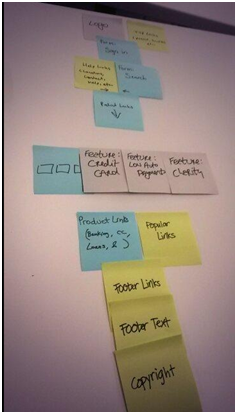
The pre-requisite here was that we were defining priority first, not layout. In groups, we decided what the most important piece of content was and worked all the way down to the least important.
As we discussed each content piece it became apparent that while it’s difficult to design for every potential size of screen, the one constant you have is the user. Focusing on what is useful for users of your website, rather than filling it with junk to pad out a design will give a better user experience regardless of screen size.
So what questions are important about content?
Does the content on your page actually have any value to the mobile user, does it have any value for any of your users? Once you’ve established that it is indeed valuable you can begin prioritizing that information and then choreograph your content based on that information.
Design/Development Workflow
The design/development workflow in the era of responsive design is also something that’s starting to change dramatically. Previously we have always worked in a typical waterfall mode; designers create a design at for e.g. 960px width, sign off the design and hand it to developers, developers code the design in pixel perfect code and we sign off the development. But design is never finished in fixed width Photoshop files for responsive design.
There is no pixel perfect design anymore because there are too many potential screen sizes to create pixel perfect designs for. Design and development needs to be much more iterative in this new environment. Because designs can change at every single different screen size the whole process of design and development needs to be more collaborative, designers and developers must work together to create the best user experience.
We also discussed the idea of getting into code much earlier – designing in the browser rather than designing in Photoshop. Dan Mall is another advocate of this approach – he has some good articles and videos worth looking at talking around the idea of being in the post psd era. Working in code earlier gives the feel of how the site will respond in different devices. Rather than creating a Photoshop document that your coded site will never truly reflect, we create something tangible that reflows as it will on live, as early as possible in the process.
Overall, it was an extremely worthwhile workshop with a master of the trade. I think it’s always been clear that building responsive sites changes how we need to work in the industry – but it’s becoming more and more apparent that that doesn’t just relate to code development. The entire process of creating a responsive site – from design right through to content needs to be evaluated in order to achieve the ultimate goal – a great user experience regardless of screen size.