:format()//media/University-sites-that-dare-to-be-different-RQ.png)
Across higher education, there’s sometimes a familiar pattern to university websites: robust menus, standardised layouts, and broad content that caters to every audience.
And for good reason—many institutions need to serve a wide range of stakeholders, and delivering a consistent, accessible, and scalable experience is essential.
But even within these boundaries, there's room to challenge convention.
This week, we look at five websites that have taken a different route.
They’re rethinking how to express their brand identity online, through bold design choices, visual storytelling, minimalist design, or narrative-led content that refect their institutional identities.
Here’s what they're doing differently.
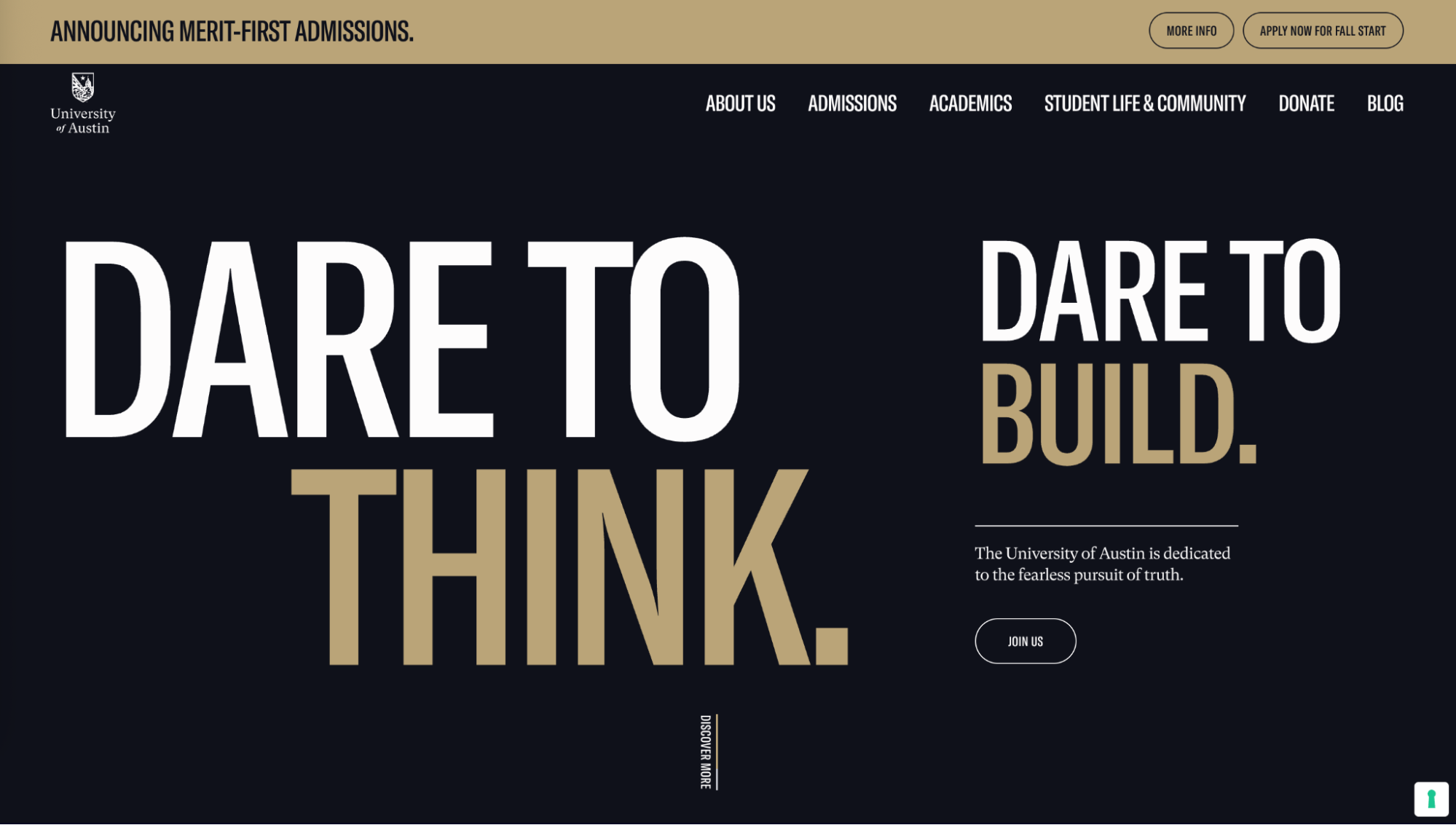
The University of Austin (UATX)’s website doesn’t just look different—it feels different.
You may have noticed the .org domain suffix, as the institution is still in the process of gaining accreditation.
UATX is relatively new as an institution, but its website already stands out in the higher education space.
There’s no overwhelming dropdown menu, no cluttered homepage, and zero reliance on stock campus photos.
Instead of a traditional university website structure, UATX went for a minimalist, narrative-driven experience with a clean interface, bold typography, generous white space, and a monochrome palette.
It feels more like a modern campaign site than a university homepage.
Interesting, they prioritize a message-first content strategy, inviting visitors to learn why the university exists before diving into what it offers.
The single-scroll storytelling leads us on a clear, linear narrative journey, while the tone—to us—mirrors that of a tech startup launch, very confident and sharp.
We’ve seen our share of sprawling menus or dropdowns—but here, there are only a handful of navigation options, giving visitors a clearly defined journey.
Opening with, “The University of Austin is dedicated to the fearless pursuit of truth,” the site sells an idea before it tries to sell a program—this is a great example of mission-first marketing with large, confident, and unignorable typography.
The story and messaging are prioritized over raw data about academics or student life, making the overall experience unapologetically focused on philosophy over process.
For a relatively new and unaccredited institution, the site’s transparency and design choices help to build trust while reinforcing a bold, values-driven identity.
2. Rhode Island School of Design: Letting student work speak
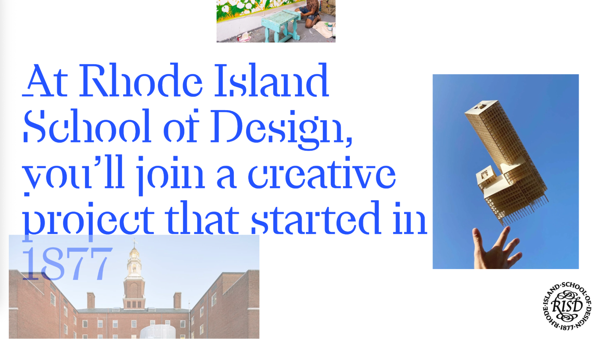
Rhode Island School of Design (RISD)'s website is a showcase of what happens when design is both the subject and the medium.
Known for its artistic focus, RSID opens with large visuals of student artwork and uses clean, minimal text to showcases creativity, making their website feel like a an artistic gallery while also communicating the school's mission visually.
Student work is in fact the core of the user journey, balancing visual richness with a minimalist design rich in white space.
Typography plays a critical role here, too: RISD uses a custom typeface designed in collaboration with one of their own alumni, reinforcing its brand identity across every page.
Users are gently guided with clarity through the site, without being overwhelmed with options.
Their narrative is supported by a thoughtfully structured content strategy that highlights current events, community stories, and key institutional milestones.
And their news, events, and community stories are updated regularly, creating a living site that reflects a vibrant campus culture.
Despite the depth of content, RISD's website maintains intuitive navigation, allowing users to easily explore various programs, departments, and resource in what feels like a seamless user journey.
It’s an experience that feels both curated and authentic—offering prospective students a strong sense of RISD’s creative ethos from the first click.
RISD’s website reflects its identity as a world-class creative institution.
Every element of the RSID website reflect its identity and reinforces its design-led culture with authenticity, which we already know Gen Z and Generation Alpha love.
3. University for the Creative Arts (UCA): Showcasing creativity through design
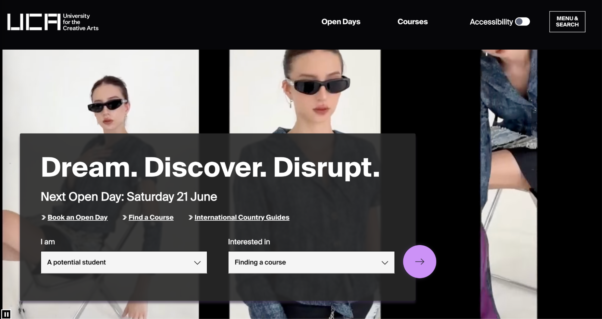
University for the Creative Arts (UCA) is known as one of the top UK creative universities, and its website feels alive with creativity with a broad spectrum of creative programmes—from animation, crafts, and interior design to film, fine art, and games—as well as the UK’s first Business School for the Creative Industries.
Far from going with a traditional look and feel, UCA’s website leans into expression, from its vibrant colour palette to its interactive design elements.
Their layouts are dynamic, transitions are fluid, and pages full of personality.
And that energy easily translates to a positive user experience, with a site that’s well-structured and easy to navigate, particularly on mobile devices.
To fully engage prospective students, course pages go beyond curriculum lists; they integrate student projects, alumni outcomes, and digital showcases that offer context and inspiration.
For an institution focused on the creative industries, UCA’s website delivers a lively experience that can echo the mindset of its audience, well-aligned with their creative and digitally fluent expectations.
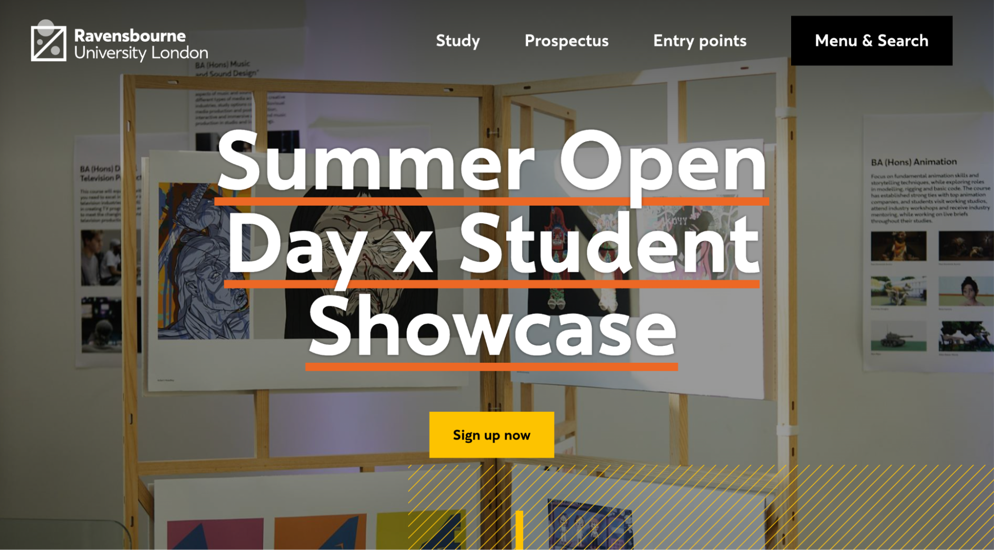
Ravensbourne University London (Ravensbourne) has carved out a clear identity in the UK higher education landscape as a future-focused, industry-connected institution.
And their forward-thinking and bold personality and is reflected in every aspect of their digital presence.
The university’s website—much like its academic offering—is lean, direct, and unapologetically modern.
With a minimalist aesthetic, the homepage is dominated by clean lines, a restrained (dark-mode) color scheme, and oversized sans-serif typography, and a real absence of… ‘clutter’, that feels both contemporary and confident.
The layout supports intuitive navigation, with primary calls to action given prominence and deeper content accessible but not intrusive, giving it more of a digital design agency feel than a typical university website—and that’s intentional.
They give prospective students a clear, curated path for users, focusing attention on core areas like courses, student work, and industry engagement.
Ravensbourne’s website sets out to mirror its audience.
It specializes in digital media, fashion, television, design, and technology, and in all these disciplines, presentation and UX are not just important but expected.
The site reflects those values with understated animations, hover interactions, and a modular layout that adapts seamlessly across devices.
Another key strength is how the site balances institutional credibility with showcasing student creativity.
The student experience is presented as active, relevant, and closely linked to creative industries, reinforcing Ravensbourne’s reputation as a launchpad for professional careers.
The site doesn't simply tell you Ravensbourne is a creative university—it shows you.
5. Yoobee College of Creative Innovation: Built for hands-on, digital learners
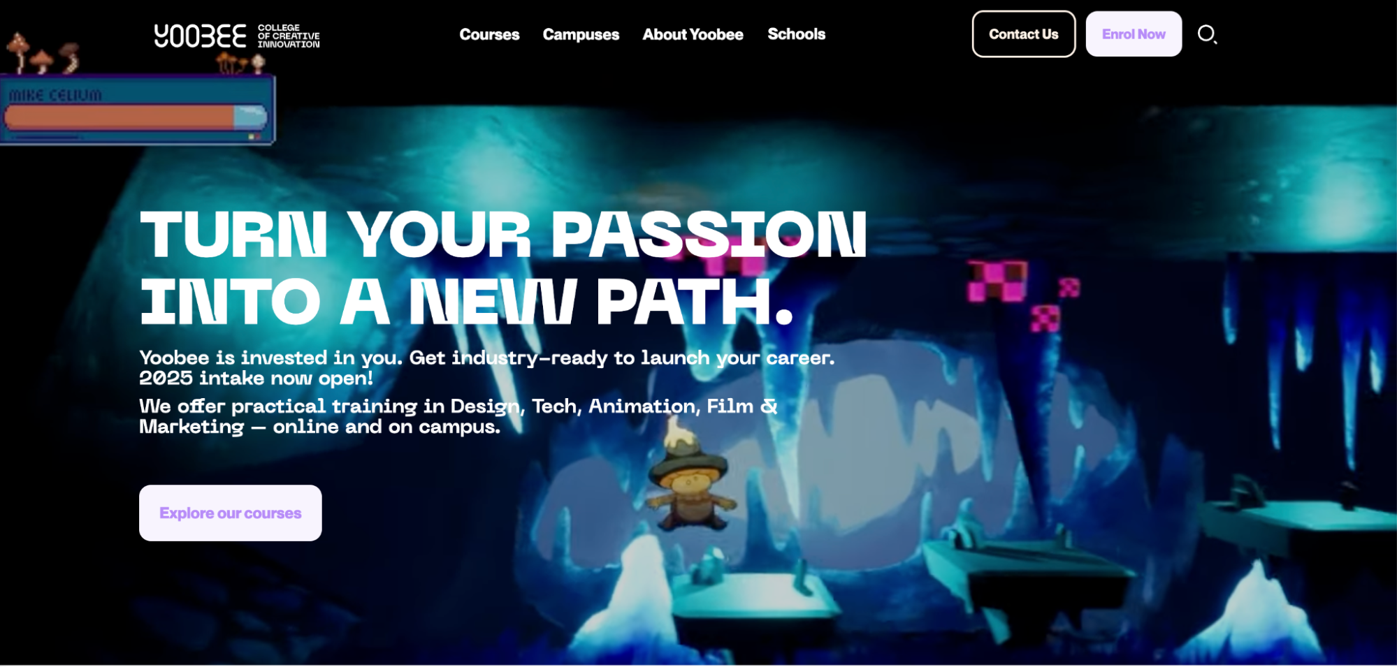
Yoobee College of Creative Innovation (Yoobee), based in New Zealand, has been nurturing New Zealand’s creative and technology talent for over 30 years, merging South Seas Film & Television School, Animation College, and Yoobee School of Design under one umbrella.
Yoobee’s website models the learning experience the school promises of hands-on practice/ mentorship and a supportive creative community with a user journey that aims to mirror these values at various touchpoints.
At first glance, the site feels dynamic and full of energy—like the fast-moving industries it serves, from animation and game development to UX design and digital marketing.
Yoobee’s website font is a geometric sans-serif that’s very legible, mobile-friendly, and adaptable across screen sizes, so it’s both practical and expressive.
From the homepage through to course-specific pages, CTAs like “Explore Our Courses,” “Enrol Now,” and “Contact Us” are placed strategically and sparingly, and never leave you wondering what to do next.
They go for a ‘nudge’ rather than ‘push’ approach.
But beyond the bold visuals and animations, which align with industry and tech trends and work really well on mobile devices, there’s a focus there to cut through complexity and immerse students in doing.
So there are no long-winded explanations, no clutter.
Users are guided quickly and confidently toward the information they need, whether it’s course details, campus locations, or application steps—mirroring the school’s belief in personalized, student-centred pathways.
Key to this is that student work isn’t confined to a portfolio section—it’s embedded throughout the site, so there’s an encouragement to explore more of the graduate projects, industry showcases, and hands-on course outcomes.
They feature real-world projects and industry partnerships right on the homepage, as well as testimonials, underpinning their focus on industry preparedness.
Their website isn’t just a marketing platform: it’s also a digital testimonial of how they’ll prepare their students to thrive in creative careers in industry.
Higher education institutions are always trying to explore new ways to stand out online. How is your university using design and storytelling to cut through the noise? What creative approaches have you tried (or are planning) to better reflect who you are and what you stand for?