:format()//media/Higher-ed-accessibility-mistakes----RQ.png)
Awareness of web accessibility has grown among university leaders and digital teams in recent years. But maintaining high accessibility standards is hard and requires continuous effort.
Last year we outlined the latest accessibility standards and what they mean for your institution. This week we're taking this a step further by covering the major accessibility mistakes we've spotted across the industry and what you can do to put your institution in the top percentile for accessibility.
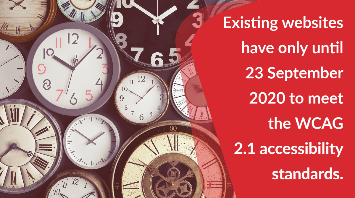
The clock is ticking - catching up with accessibility requirements
Last year research showed that the majority of university websites didn't meet global accessibility standards and needed development to meet new accessibility laws.
According to Sitemorse, 80 percent of the university websites it tested reported back a score of less than five out of ten for website accessibility. The study also showed that over 40 percent of PDFs on university websites failed accessibility tests, meaning that these institutions also did not follow the principles of the WCAG 2.1 AA global web accessibility guidelines. You can read some of the Sitemorse blogs on this topics here:
Why is it difficult to meet accessibility standards?
Part of the challenge is the sheer volume of content universities have online, making it difficult to monitor content for accessibility.
Web-accessibility software can help, for instance, to check to see if webpages have alt-tags on images accurately describing images so that people using screen readers can know what's there. But software does not offer a complete solution. For instance, no software can tell you if descriptions are an accurate representation of the images they describe.
Another issue is the number of sites that fall within a university estate and maintaining them all to ensure they meet the required accessibility standards.
And of course, there are the ever-changing goalposts in terms of accessibility, evolving web standards and the proliferation of devices, which adds to the complexity of accessibility compliance.
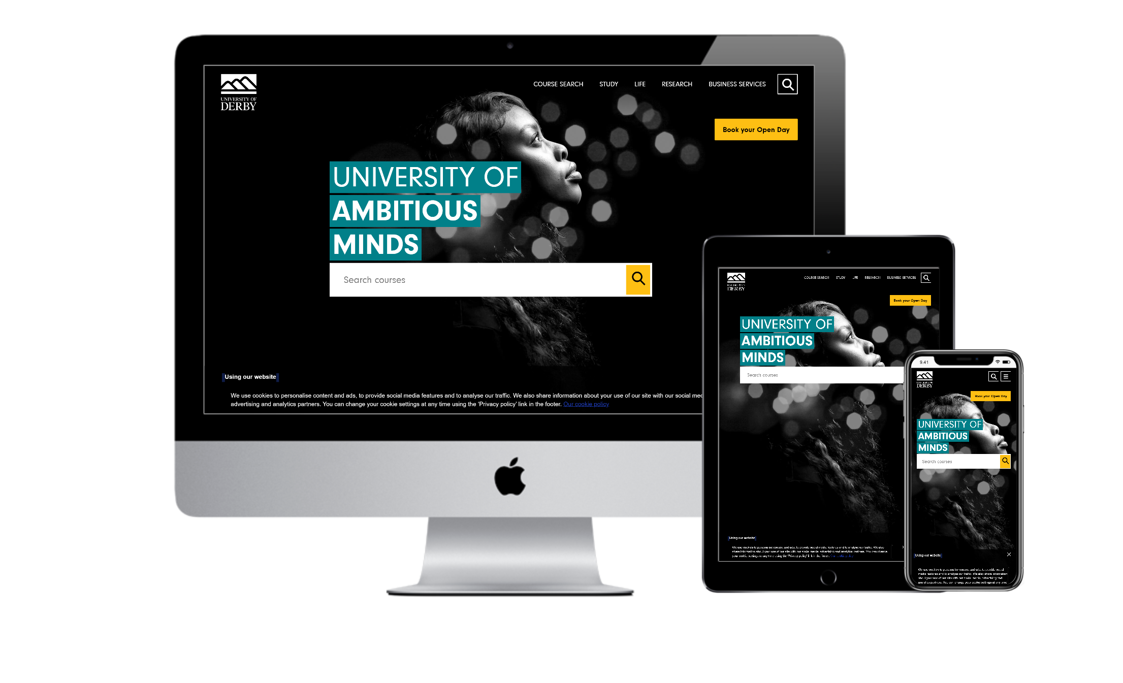
The University of Derby have naturally occurring contrast that allows them to comply with this area of accessibility.
The top 5 most common fails in accessibility across the HE industry
Here are the most common accessibility issues found on university websites.
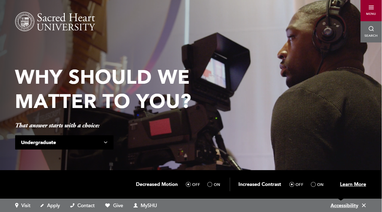
1. Insufficient color contrast - font and background color combinations with low contrast can be a problem for people with high contrast sensitivity or color blindness. WCAG 2.1 level AA requires a contrast ratio of at least 3.1. Sacred Heart University have incorporated a contrast changer onto their website. This allows users to create a contrast that works best for them.
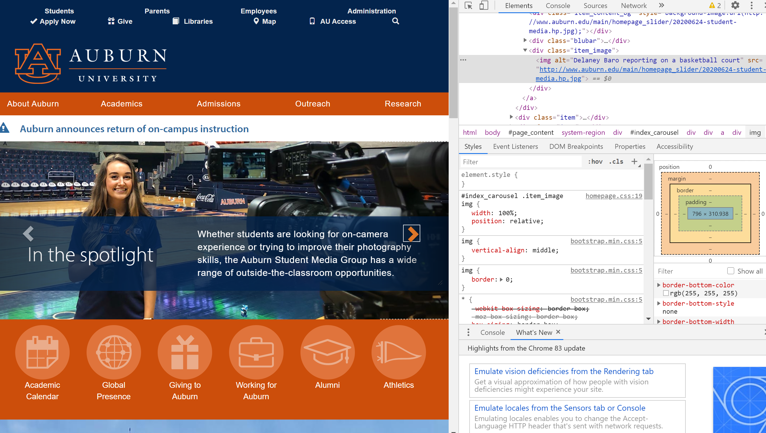
2. Missing or poorly described alt-text on images - for people with additional visibility requirements, descriptions of images can be extremely important. For a site to be accessible every image should have an ALT attribute with an accurate description appropriate to the specific context of images. Auburn University website is bold and striking, with bright and beautiful images. They're a great example of how to create a stunning site with accurate Alt Text.
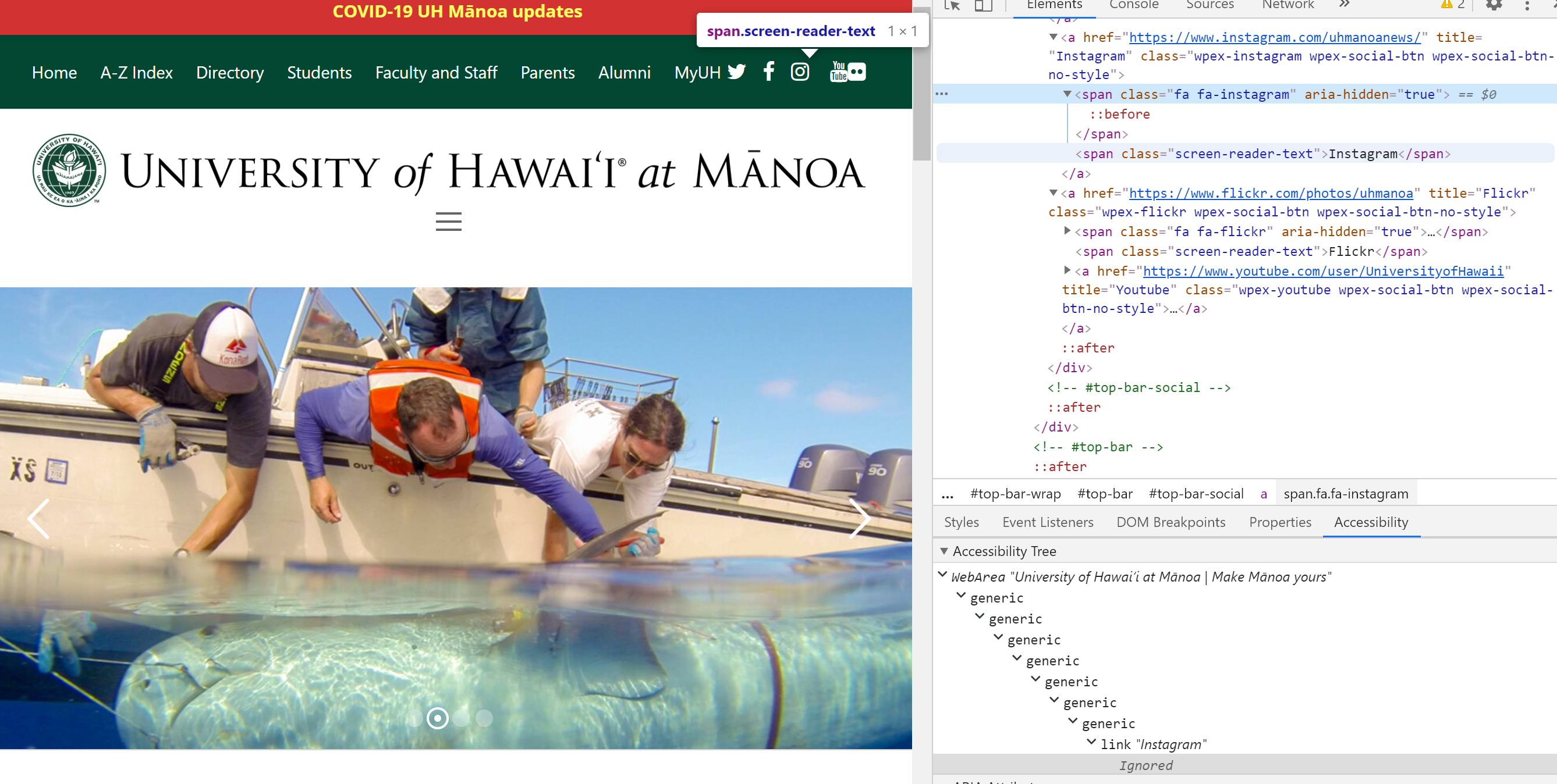
3. Inaccurate link text - website users who rely on assistive technology such as screen readers often have to navigate from link to link. However, link text often does not provide enough detail to allow for an understanding of the link's purpose. University of Hawaii at Manoa’s website includes descriptive link text, even for icons.
4. Re-sized text issues - people with visual impairments often increase the size of the text by zooming in on their browser settings. In many cases, resizing text to 200% or more can break the layouts of HE sites or result in content overlapping which makes the site more difficult to read. Ideally, the text should re-flow to adapt to the available viewing area.
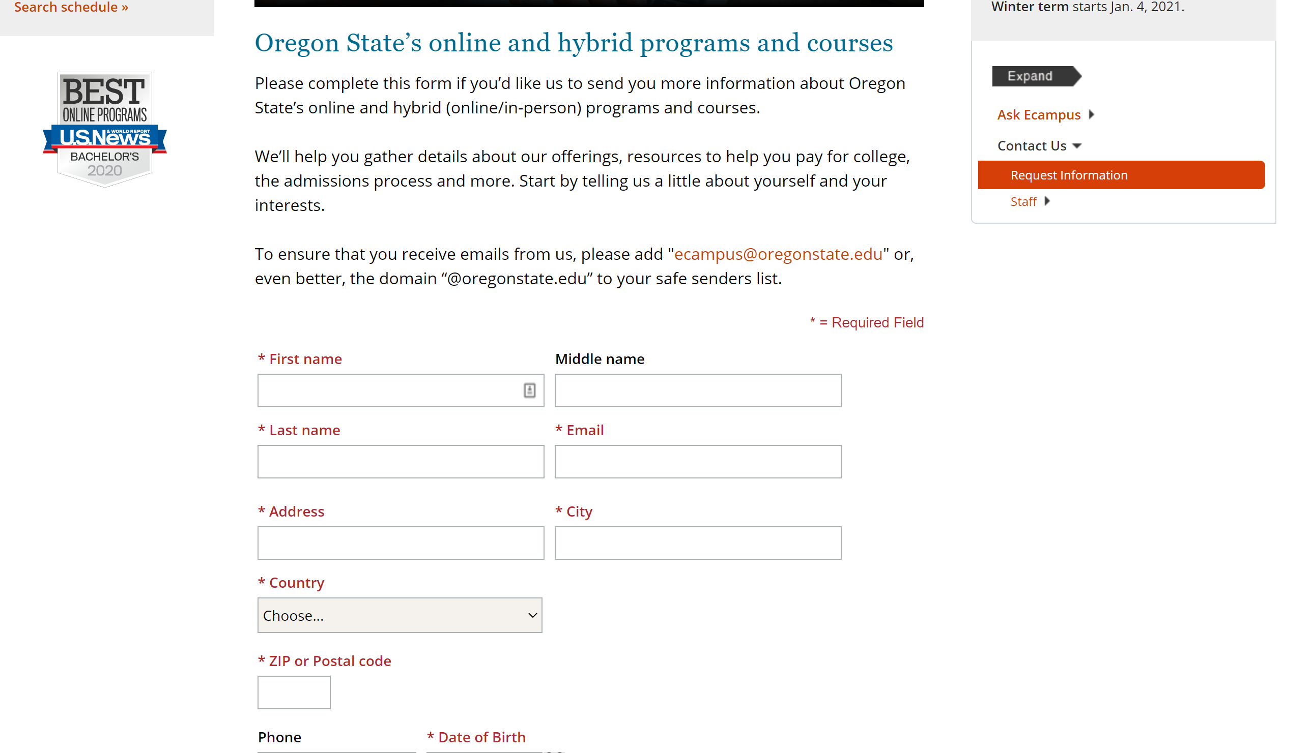
5. Missing form input labels - making it impossible for people using assistive technology to enter form information correctly. Oregon State University’s website’s forms are all correctly and clearly labeled.
How to go about raising accessibility standards at your institution
Clearly, the main website for most institutions receives the majority of the resources and attention. However, many universities have sprawling digital estates of internally and externally hosted sites and it can be hard to get a handle on the totality of the sites within the institution's remit.
But regulators and visitors aren't concerned with ownership technicalities. It all looks like one website from the viewpoint of external audiences. The best starting point for many institutions is, therefore, to locate and categorize the full range of sites within the institution's ownership.
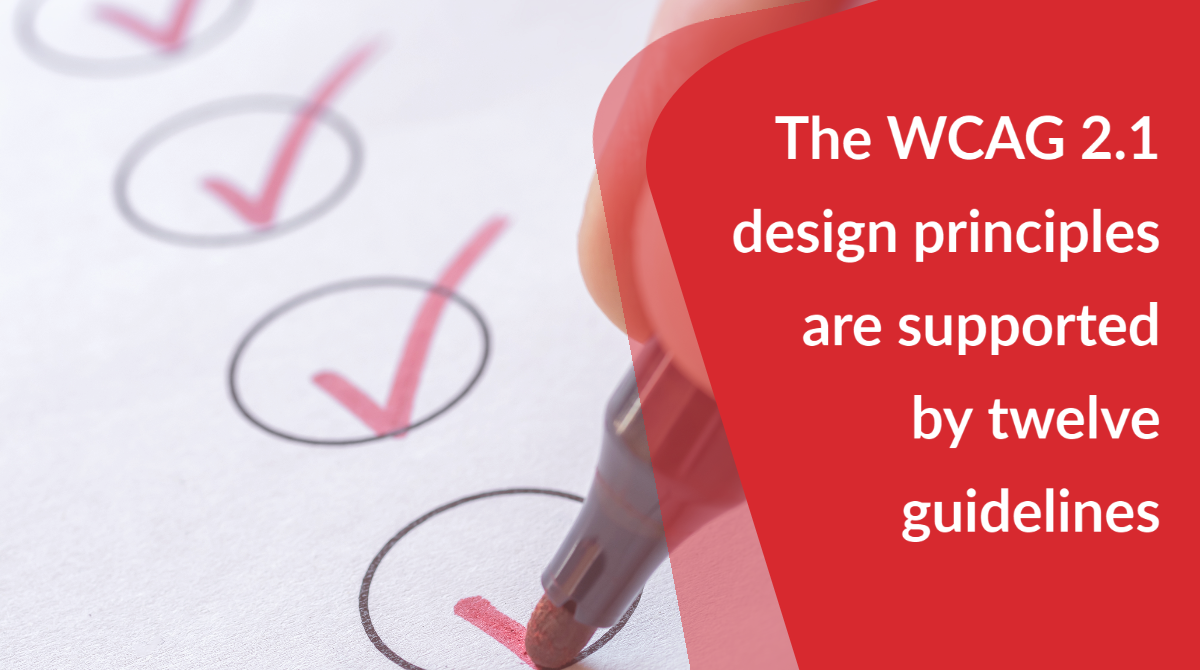
The WCAG 2.1 design principles are supported by twelve guidelines. As an institution, you need to do regular accessibility testing across all university-owned sites to check that the design, code, and content meet WCAG level AA.
You should use a combination of automated tools and manual tests, and should also undertake an accessibility audit to evidence that your sites meet at least the AA accessibility level.
Putting user needs at the center of your website experience
Designing an accessible website is an ongoing commitment. One that means analyzing your accessibility provision, spending time educating your teams, investing in new techniques, and focusing on where to improve.
But when you incorporate web accessibility as a component of your site development cycle, starting with correcting the most common accessibility problems, you can make a real impact for your site visitors.
Web accessibility doesn't only impact impaired users. It has far-reaching effects on your website as a whole.
Showing that you care about users who may be impaired shows that you care for your users on the whole, which will gain you their trust, their respect, and their loyalty and help to make the site as useful as possible for visitors.
You can't make everything accessible overnight. But by prioritizing, having a defined roadmap and demonstrating progress, you can raise the bar for accessibility, delight your audiences, and beat the regulatory hurdles coming through in 2020.