:format()//media/CTAs---examples-from-Higher-Education_RQ.png)
We know the theory (see Lights, Camera, Calls to Action: Sales Friend and Marketing Foe?), and so here are just some examples from UK and US Universities – but what do you think? Share your thoughts and examples with us.
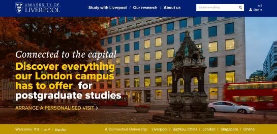
A bold, image-based CTA where the benefits for prospective postgraduate students are clearly explained – ‘connected to the capital’. The audience is clear, the contrast of the yellow and white on the darker background works well and a strong action word has been used (arrange) to entice the user into further action.
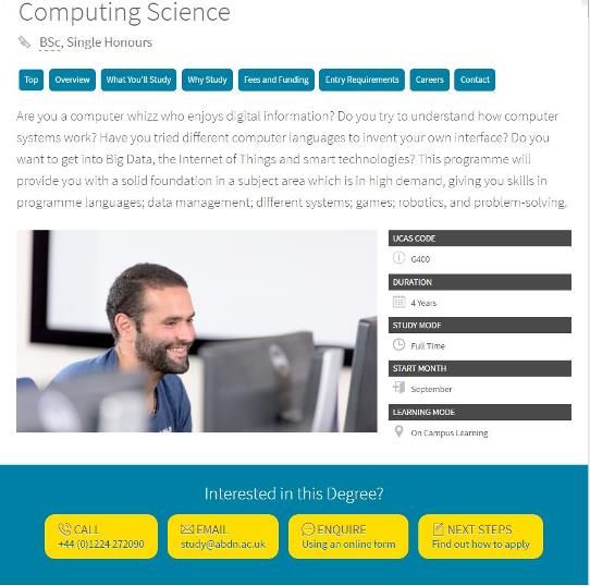
1. The CTAs are in context with the content that is on the page (course information for prospective students) and the yellow contrasts well with the background colour. One suggested improvement is changing the colour of the ‘Next Steps’ link to show that it is a link to more content rather than an action. Also, the wording on the ‘Enquire’ button could be altered to say ‘our online form’ rather than ‘an online form’ as this sounds more credible and potentially trustworthy.
2. The CTAs stand out clearly from the page (even though the magenta might not be to everyone’s taste!) and the text makes it clear what will happen when the button is clicked on. Simple and effective.
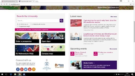
Loughborough have clear CTA text on their home page and the ‘order a prospectus’ link goes straight to a form to order the prospectus, rather than any interim page, making the user journey quick and straight forward. Their contrasting black colour help them stand out from other link text (more magenta!). The social media buttons are also clear, encouraging visitors to the site to engage with them on social media channels.
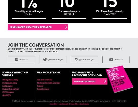
Another good example of a prospectus download CTA on the home page that, when clicked, opens the PDF straight away and doesn’t break the user journey by asking for personal data or going to another page unnecessarily. The social media channels are also clear as is how to learn more about research at UEA – a strong action word, and more contrasting magenta!
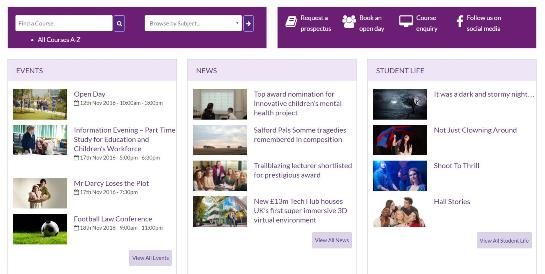
Clearly labelled icons are used here to take the user on to the next stage of their journey. Wording has been carefully thought out (maybe even tested). ‘Request a Prospectus’ is used, rather than ‘download’, as the user is taken to another page to choose the right prospectus for them. From here, the prospect must enter their details before receiving a prospectus, putting them into the ‘sales funnel’ whether they like it or not. Of course, if further content is delivered to the prospect that will aid their decision-making process and prove genuinely useful, this may not be a bad thing.
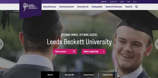
Understanding their main audience for the home page (prospective students) has enabled Beckett to be bold and give its users the two main choices it requires – course information and how to book on an open day. Clear icons show the user that one button will bring up a search tool whilst the other takes them to more information. And (again!) contrasting magenta works well against the darker background.
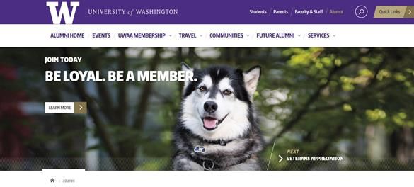
Fundraising from Alumni in the USA is big business and Washington have used striking imagery to appeal to its alumni (Washington Huskies is the nickname of the University of Washington's athletic teams) and gain empathy and engagement and attract their attention. The call to action is simple rather than aggressive – learn more. It would be interesting to know if Washington did any split testing on the wording of this button to see if ‘learn more’ got more engagement than e.g. Donate Now or Join Now.
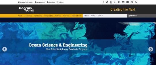
The contrast in colour between the main menu and the CTAs draw the user’s eye to the main topics that their key audience groups will want to know about (Visit, Apply) or that the University wants them to know about (Donate). Positioning on the right hand side means that they are more likely to be noticed and the clear, simple text makes it obvious to the user what content they will get next.
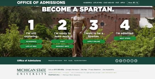
These CTAs are within the Admissions section of the University and are relevant to the stage that the prospective student may be at in their decision-making process. The buttons clearly guide the user through the information that will be useful to them at that stage. The contrasting colours of the buttons are within the University’s colour palette. These ones may stand out a bit more if they were on a different background that wasn’t also green (magenta, maybe!)
Author: Claire Gibbons, Digital, Marketing, Higher Education and Content Consultant.
https://twitter.com/PlanetClaire