:format()//media/Content-strategy-for-multi-platform-publishing_RQ.png)
Responsive web design (RWD) techniques allow designers to create websites which work across the mobile, desktop and wide-screen browser spectrum. Web pages exist now which respond to the available viewport width, CSS media queries are used to adapt the presentation and the slick, modern design stands up across all devices. These techniques have solved many problems. Designers have a trusted (though still evolving) methodology; there is one code-base to maintain; mobile site visitors are not missing anything – the crucial content will be there, if rendered differently; and for site owners the question of whether to have a separate mobile version of the site is now moot, there is one site to rule them all.
So all problems are solved?
Well, no. From a content creator’s point of view a new set of challenges has emerged. As Karen McGrane put it in her article, despite the impression given, RWD does not solve any content problems.
Reshuffling and hiding and showing content, swapping content in and out, especially media, and resizing content all have consequences. For media, there is often at least one variation of each image: textual content priority becomes important due to limited space and there may be more than one version of key content elements. Context has become variable and is critical, and content editors need to respond. So, content must become responsive to match the context.
This post looks at some of the techniques that are available at the content editing level in this situation using TERMINALFOUR Site Manager to mitigate some of the issues.
I acknowledge that this is the tip of rather a big iceberg and I could get into areas such as structured content and much broader questions about strategy. But that’s another day’s work.
To show these techniques I create an example content type which includes some elements to deal with the issues mentioned. I leverage some of the responsive capabilities from the Foundation framework including its visibility classes and content JavaScript interchange module to adapt the rendered content as needed. Other frameworks provide similar capabilities and you can write your own if you know an obliging and capable developer.
The example
I will focus the example on some content which represents a program description for an imaginary university. The goal is to provide potential students of the university with information about available study programs and to encourage them to find out more about what’s on offer so that they ultimately enrol in the university this coming autumn.
The content is comprised of:
- An introduction/teaser about the program
- A broader 1,500 word description
- Video content of current students describing their experience at the institution
- A banner image
The page into which the content is published will be responsive.
Responding to context
Context is the thing. It provides the limitations within which content must be rendered and we need to account for it. Given the variability of context, the primary concern is prioritizing for display.
To handle this there will be:
- Two instances of the banner image, with a hi- and lo-res for each, so that’s four images
- There will be two variations of the intro
- The video embed will be removed and replaced with a text link to view the video in the external video site in mobile using Interchange
- The body will be split into three parts with each prioritized depending on display sizes.
The Foundation CSS visibility classes = are intuitively named:
show-for-small-only
show-for-medium-only
show-for-large-only
show-for-large-up
show-for-xlarge-only
show-for-xlarge-up
show-for-xxlarge-up
I apply those as required in the content layout of the content type.
The framework’s “Interchange” module allows users to swap content depending on the available screen width. Images and any other arbitrary HTML content can be interchanged, there’s a great example using Google Maps on their docs page. To use this, there is an additional content layout added for each alternate element and the content is duplicated into hidden sections which use a black page layout and formatted there using the alternate layouts.
This shows my content type with all of the required elements:
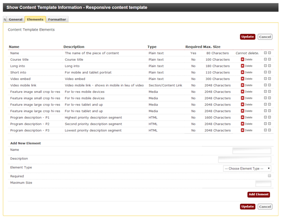
The body element has been split up into high-, medium- and low-priority segments. The HTML mark-up that each of these elements produces is wrapped in an HTML <div> element. I use the visibility classes appropriate for each segment on the wrapping <div> – the high-priority segments shows in all screens; medium-priority shows in tablet and upward and low-priority shows in desktop only.
For the introduction, there is a Long into and a Short intro. Again, Foundation CSS visibility classes are used to hide and show each. The Long intro shows for tablet and upward and the Short intro shows for mobile only.
There are two crops of each image one for large and one for mobile and there is a hi-res version of each. Custom named queries would be set up to load the retina version of each image (see the Foundation docs about that) from each of the hidden sections which contain the alternate content.
<img data-interchange="[../path/to/mob-crop-lo-res, (small)],[../path/to/mob-crop-hi-res,(small_retina)], [../path/to/large-crop-lo-res, (large)], [../path/to/large-crop-hi-res, (large_retina)]” />
The appropriate image is loaded in the page depending on screen width and pixel density.
Similarly for the video content, it is wrapped in an HTML <div> with an interchange query which gets the link in place of the video for mobile.
<div data-interchange="[../path/to/videolink.html, (small)], [../path/to/videoembed.html, (medium)]”>
<!-- appropriate content -->
</div>
Here there is also a way to account for the responsive layout and to give the content editors the ability to prioritize content and to select which content will be shown and what will be hidden.
Other approaches could be used including using a managed list to apply visibility classes to elements in a more abstract content type which contained several general HTML/plain text/media elements.
The list entries would be “Show in small only”, “Show for medium up” etc, and the entries would be the corresponding CSS class names. The output from the list would which version of the element is displayed depending on context.
Summary
Referring back to Karen McGrane’s article, responsive web design is not a content strategy for mobile. Context is flexible and content needs to catch up. What’s described here are a couple of methods that can be used now in TERMINALFOUR Site Manager to achieve this flexibility.
I hope you find it useful and that maybe it sparks some other thoughts for how to solve this successfully.
Helpful links
http://alistapart.com/column/responsive-design-wont-fix-your-content-problem
http://www.nngroup.com/articles/responsive-web-design-definition/