:format()//media/7-website-design-trends-for-2022-RQ.png)
Striking, daring and playful can all sum up web design in 2022 so far, as the industry heads into something of a renaissance.
Shifting from minimalist, image-led designs to bold typography, forward-thinking visual effects and retro themes, web design is taking a bold new turn and becoming more and more of an art form.
Perhaps this seismic shift has been spurred on by the imminent arrival of the metaverse and the need to re-draw boundaries.
Or maybe by a desire for something new and fresh after two years of predictability in pandemic browsing.
It’s probably a combination of both, coupled with a piquing cultural interest for 80s and 90s nostalgia.
In any case, this exciting new chapter in web design—almost harking back to the explosion of creativity seen at the launch of the internet—offers a new world of opportunity…
…And one that needs to be grabbed with both hands to stand out from the crowd!
So without further ado, here are seven of the prominent themes we’re seeing across web design that could inspire the look and feel of your website and other digital activity this year and beyond.
#1 Interactive features
Web designers have been unlocking increasing levels of creativity of late as they steer away from more photo-led experiences to inject a bit of fun, interactivity, and, often, a dose of humor into sites.
A lot of this has been powered by breakthroughs in front-end development techniques.
But it’s also perhaps underpinned by a desire to offer more to audiences, to capture their attention and create meaningful engagement with app-like experiences.
Interactive animations are also taking center stage, replacing photos altogether, such as in How Many Plants.
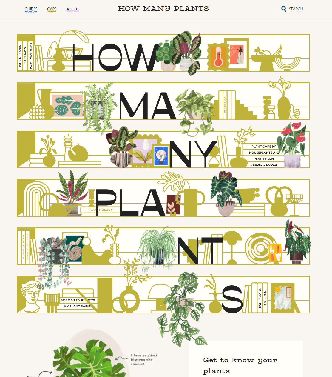
We’re also seeing more handmade graphics, as designers look to fuse the online and offline worlds to boost relatability and artistic flair.
The aim is to subvert expectations while maintaining a user-centric concept, keeping things fun but accessible and useable.
Imagination is key here, and it will need a sensible approach when it comes to higher education websites—which ultimately are the first port of call in the serious decision-making process of prospective students.
But, there’s certainly room for development in the realm of interactive elements such as quizzes and hover-responsive text, or perhaps in fun, spin-off mini-sites.
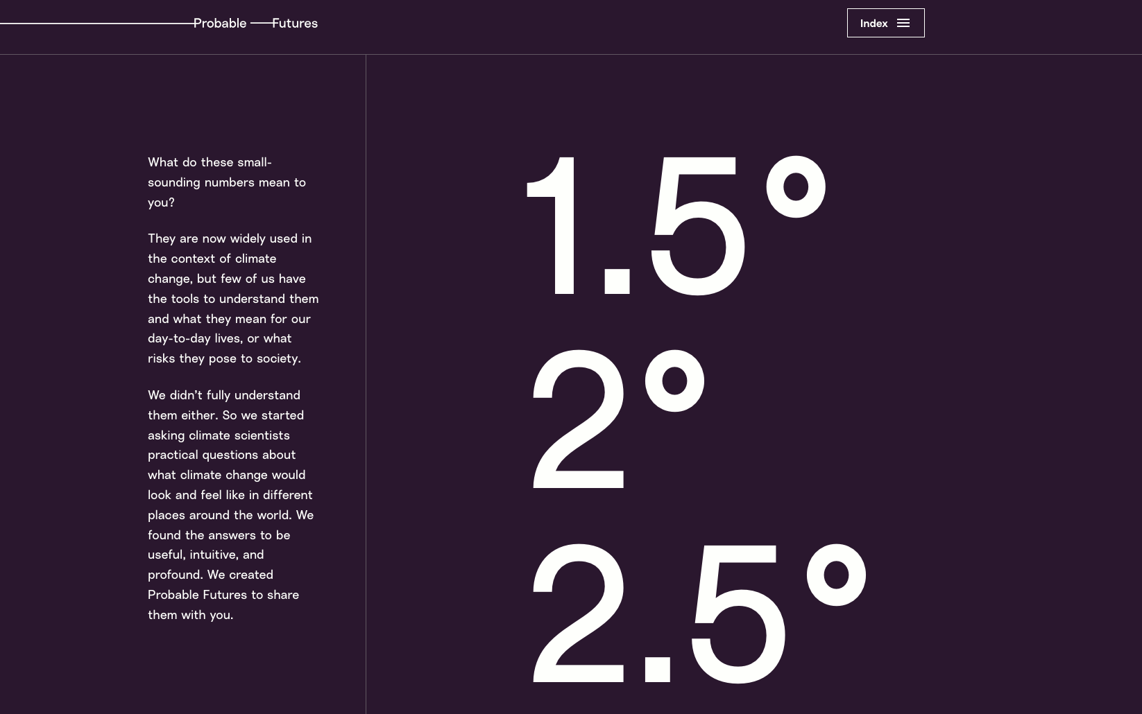
#2 Scrollytelling
In another nudge away from minimalist design, immersive pages that tell a story as you scroll are rising in popularity.
This has the goal of surprising and delighting users.
And there seems to be ever more creativity in this approach with some examples adopting parallax, three-dimensional effects alongside moving imagery and typography.
It can encourage users to reach the bottom of the page and absorb more messaging, preventing them from getting lost along the way.
The University of East Anglia is ahead of the curve here, taking users on a journey from space to seabed with its intergalactic interface. This gives way to mountain terrain and the depths of the ocean—really telling the story of the University’s work and selling its gravitas to prospective students. Outside of the higher education sphere, another shining example of scrollytelling perfected can be seen on Twitch.
#3 Nostalgia
Inspired by earlier pop art and art deco movements, Memphis design from the 80s seems to be making a comeback and has inspired many websites of late.
Memphis design is defined by simple geometric shapes clashing with monochrome stripes and abstract squiggles, on a palate mixed with muted colours and bold, contrasting shades.
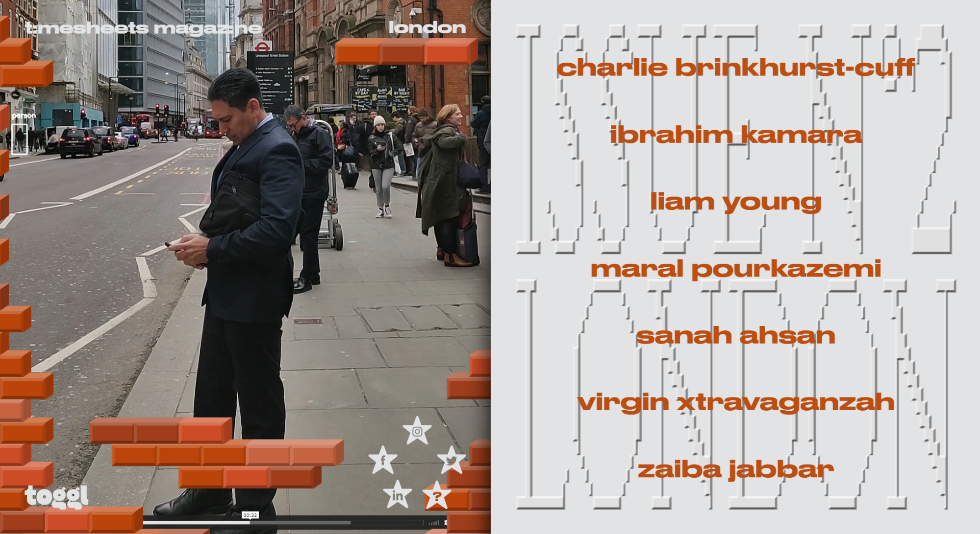
https://toggl.com/timesheets-magazine-london/
It’s effectively a rejection of minimalism, which we’ve seen so much of in web design in recent years. It’s a fun approach, which could sit particularly well with young audiences tired of generic page layouts.
We’re also seeing designs inspired by the early days of the internet in the 90s, with bright backgrounds and robotic typefaces complemented by modern-day functionality, speed and accessibility.
These designs celebrate the excitement and creativity of simpler days when the parameters of internet design were yet to be defined.
This comes at a time when many websites are ripping up the rulebook to inject some flair and fun into user journeys.
#4 Bold typography
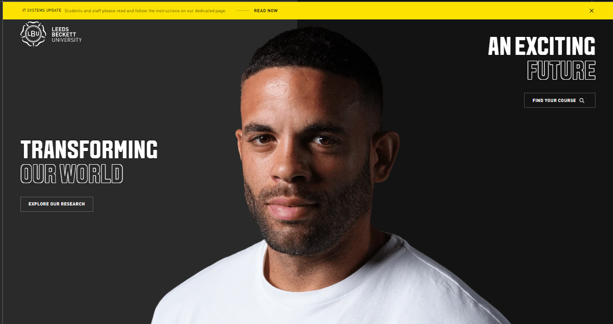 https://www.leedsbeckett.ac.uk/
Oversized typography, often brutalist in style, is a fresh and versatile trend that we’re seeing more of.
It's a sure-fire way to make the big impact, setting it as a focal point of a page rather than as a means just to deliver supplementary content.
Bold fonts are now sometimes overtaking images as the main design elements of pages, allowing opportunities to inject more personality into layouts.
And we’re often seeing these fonts complementing the steer towards interactive and moving elements we’ve touched upon above.
Among examples we’re seeing of this trend in the higher education world is Leeds Beckett University, which features stylized fonts on a black background against a striking cut-out image.
#5 Simplified hero slices
Led by the surge in bold type, developers are fast turning their backs on images and video in hero slices and favoring impactful, stylized lettering.
Not only is it an attention-commanding route; it’s also a page-ranking tactic.
One of Google Page Experience’s key metrics to measure user experience is load speed, and content above page folds therefore needs to be free of embedded content that might slow things down.
It’s no surprise, then, that there’s this shift towards simplified content in the hero section of pages.
But in an online world where there is lessened importance in images and video, higher education websites need to strike a balance, as these visuals will remain crucial to conveying campus life and experiences to potential new students.
#6 Locations in focus
Another strong theme is a sense of place on websites, perhaps borne out of two years of missing travel and longing to be somewhere else.
 But it's a concept that’s well suited to university websites, given that the location is often just as much—if not more—of consideration to prospective students than the institution itself.
We’ve seen some universities pivot their location in digital marketing strategies recently, such as Swansea University in its Come Find Space campaign.
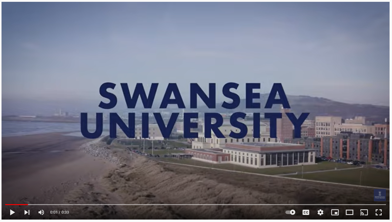 But perhaps the focus on setting will take more of a front seat, particularly for institutions for which location is its biggest unique selling proposition.
It's all about invoking a feeling of belonging to a place, capturing both the hearts and minds of future students.
#7 Horizontal scrolling
This once-taboo trend is enjoying a bit of a rebirth after earlier attempts at shaking up scrolling patterns fell by the wayside.
Many web developers believe this format improves functionality and practicality, especially when it comes to smartphones and iPads. And this may be why we’re seeing increasing numbers of sites adopting this approach.
The benefits include consistent scrolling (or swiping) across all devices, handheld and desktop, and allowing space for secondary information without taking up too much of the page.
The Gray’s School of Art’s digital degree show is a shining of example of how to do this well.
___
Which web design trends are you looking to embrace in 2022? Are there any you’ve seen that have captured your imagination?
We’d love to hear in the comments below, on social or simply reach out to our team and share your thoughts.