:format()//media/Form-Blog-RQ.png)
Have you ever started filling out an online form only to abandon it part-way through?
If so, you're not alone. And most institutions experience thousands of abandoned form submissions each year.
The good news is there are many things you can to improve the design and user experience to maximize these data capture opportunities. They include seemingly small details such as providing explanatory information alongside form fields, using logical sequencing or invoking the correct keyboard on mobile devices.
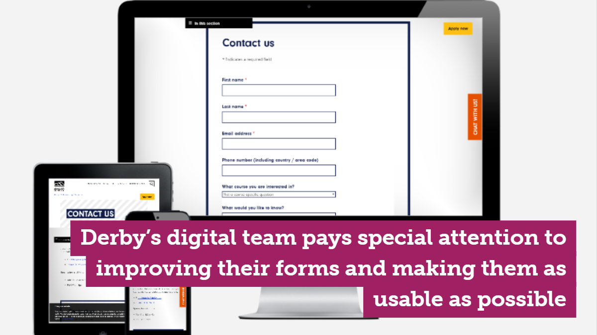
Many digital teams already pay special attention to improving their forms and making them as usable as possible. For other institutions, there are dozens of mico-improvements that can aggregate to make a significant difference.
In this article, we explore these considerations to help optimize and analyze forms across your institution's website. You can take these recommendations as a starting point for optimizing your form design.
Using analytics tools to understand your current form performance
The first step towards optimizing forms on your university website is to understand how they are currently performing.
You can begin by categorizing the types of forms across the site, for example, forms to register interest in open days, event forms, prospectus request forms, and so on.
It's then worthwhile checking that your event tracking in Google Analytics is working to analyze the overall performance of each and running a cross-check to ensure form submission data is being stored as expected.
Next, it's time to get more granular.
Form analytics tools, such as HotJar or Formisimo, come into their own here. They can identify how many form submissions generate errors, which fields take too long to fill in, which are regularly left blank, which are the most corrected fields, how long the overall forms take to complete, and why your visitors abandon your form and page.
By this stage, you'll have a useful set of baseline data to track changing performance against, and software like Formissimo can also benchmark your form data against industry averages to give you an even clearer insight into your performance.

Applying usability rules to create great form experiences
After successfully delivering over 200 university websites across the world, one of the many things we've learned is that seemingly subtle changes to a form can make a world of difference. Often, they are what distinguish a highly converting form from one that gets abandoned.
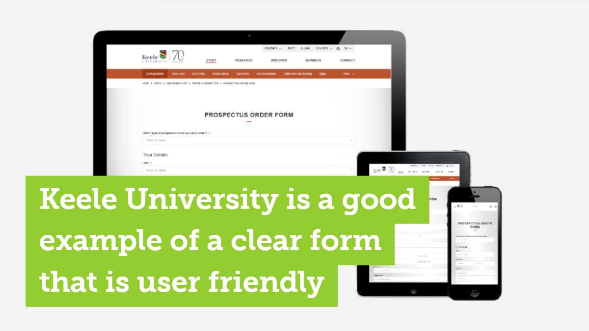
If you're re-designing your forms, make them simple, user-friendly and intuitive. The next section tells you how and outlines the most important considerations you should make.
#1 Minimize the number of fields
Nobody likes a long-form. Every piece of information you ask for is another hurdle for your user to get over before they complete the submission.
Wherever possible, therefore, you should seek to minimize the number of fields and strip back the amount of information you request to keep user effort down to a minimum on all devices.
Eliminating unnecessary questions will increase completion rates.
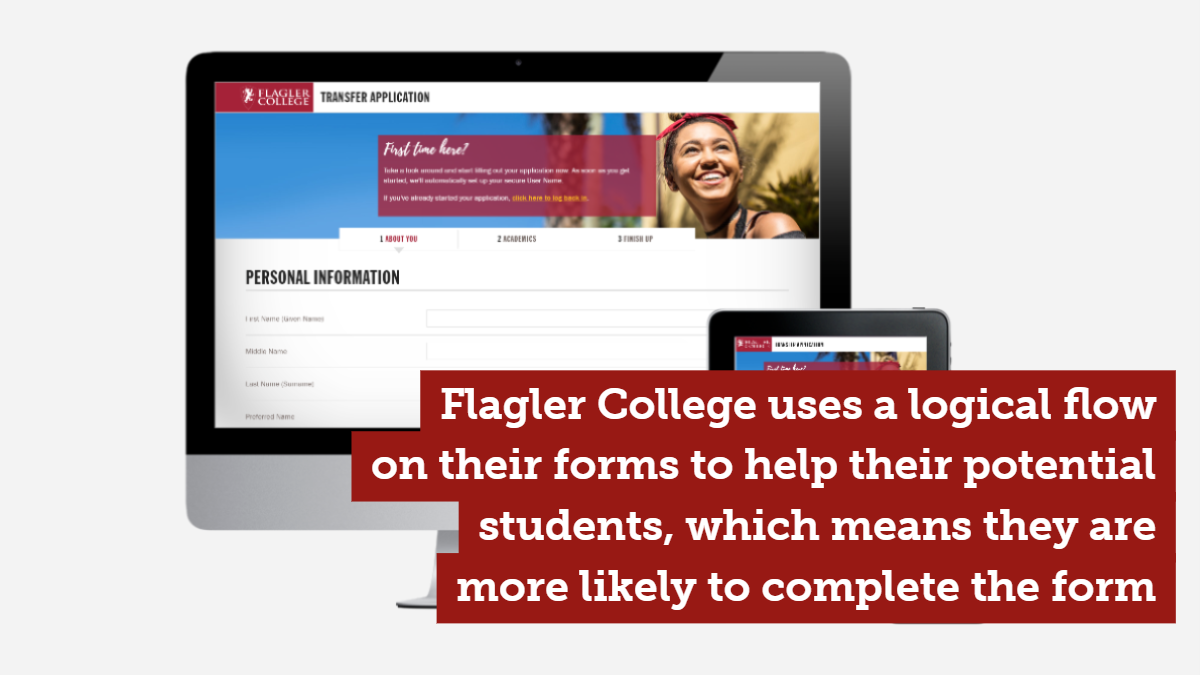
#2 Design a logical flow
Questions should be kept in an intuitive sequence. On short forms, this can be a given. On longer forms, the flow of questions should resemble a conversation so they feel natural and logical.
#3 Match field size to the estimated character input
Usability studies have found that if a field is a disproportionate size to the information being entered by a user it can lead to doubt and confusion. Adjust the widths of fields so they are the appropriate size for user entries to minimize confusion.
#4 Avoid placeholder text inside form fields
It's a common misconception that guidance text inside a form field helps users. Whilst it can work well for simple forms, it is less appropriate than field labels on longer forms because it disappears once the user interacts with the field and some users assume it has been pre-filled in and ignore it.
Explanatory text for fields should be designed as floating labels that appear once a field has been selected by the user.

#5 Distinguish optional and required fields
Where possible avoid optional fields. But if they are strictly necessary you should clearly highlight which fields are optional. To avoid cluttering the form you needn't highlight the required fields. Adding a validation indicator can further help users to understand their requirements for filling in the form.
#6 Cover formatting variations
Forcing users to conform to a set format is less preferable than putting further effort into the form functionality so that it can accept data in various forms and rationalizing it behind the scenes. If you are asking users to leave their phone numbers, for example, you should build the form to interpret multiple formats.
#7 Locate error messages where they are highly visible
Form validation comes into play when a user either misses to fill in a field or includes incorrect information.
If feasible it's best to provide user feedback immediately at the point of filling in the field because users typically don't like to discover mistakes at the end of submitting a form. If a specific format is required this should be stated as feedback.
It's easy to create a form - the hard part is getting people to fill it in
Even though we have many more options for capturing data directly from site visitors - conversational forms, chatbots, LiveChat for example - the traditional website form we're all familiar with lives on and remains important across university sites. In fact, recent research has found that 86% of people fill out at least one web form per week!
Budgets are increasing to acquire more and more good quality traffic and to craft persuasive high-impact content, but often the final stage of the funnel (forms) could be further optimized.
Make form design a strength rather than a weakness and the result will be faster completion times and fewer form dropouts for users, and higher conversions for your institution.